

Documentation
Written as a course rather than as a reference. If you have just been handed a panel and do not yet know what a section is, start at the top of Getting started and read down.
Every article here is about a screen you can open while you read it. Where something is a deliberate limit rather than a missing feature, it says so and says why.
Getting started
The first hour: sections, pages and putting something on one.
Sections and Addresses
Back to topA section is a mini-site: its own design, its own logo, its own contacts. Everything else follows from that.
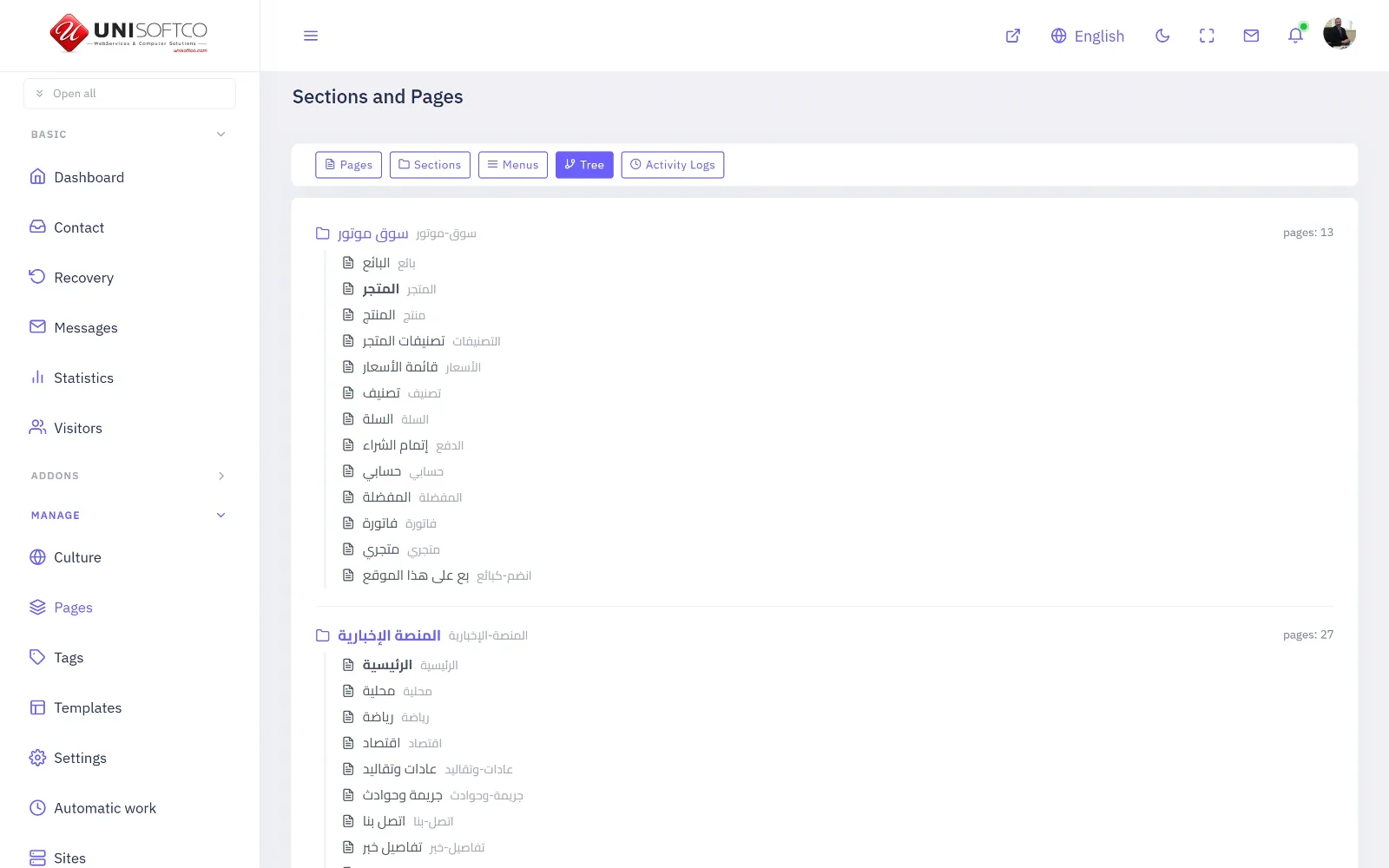
A section owns its own look
Give a section a design and it wears that design — its own header, its own footer, its own logo for a light background and another for a dark one, its own slogan, its own telephone numbers and its own place on a map. A site with one section looks like an ordinary site. A site with six looks like six.
That is why a newsroom and a shop can live at one address without either looking like the other.
The address is two parts, and never three
Everything a reader can open is /section/page. A third part of the address is only ever the name of one thing — an article, a product, a company — and it is legal only on a page whose job is to show one of those. A fourth part is always an error.
That rule is worth knowing early because it explains a limit you will meet: a page cannot live inside another page. What nests is the menu, which is what a reader actually sees.
The language lives on the page
A page belongs to exactly one language, and the language never appears in the address. If you want a site organised by language, name your sections after them — many do — but that is your choice and not a rule of the platform.
Your First Page
Back to topA page has no content of its own. Everything on it is a component you place — including the plain text.
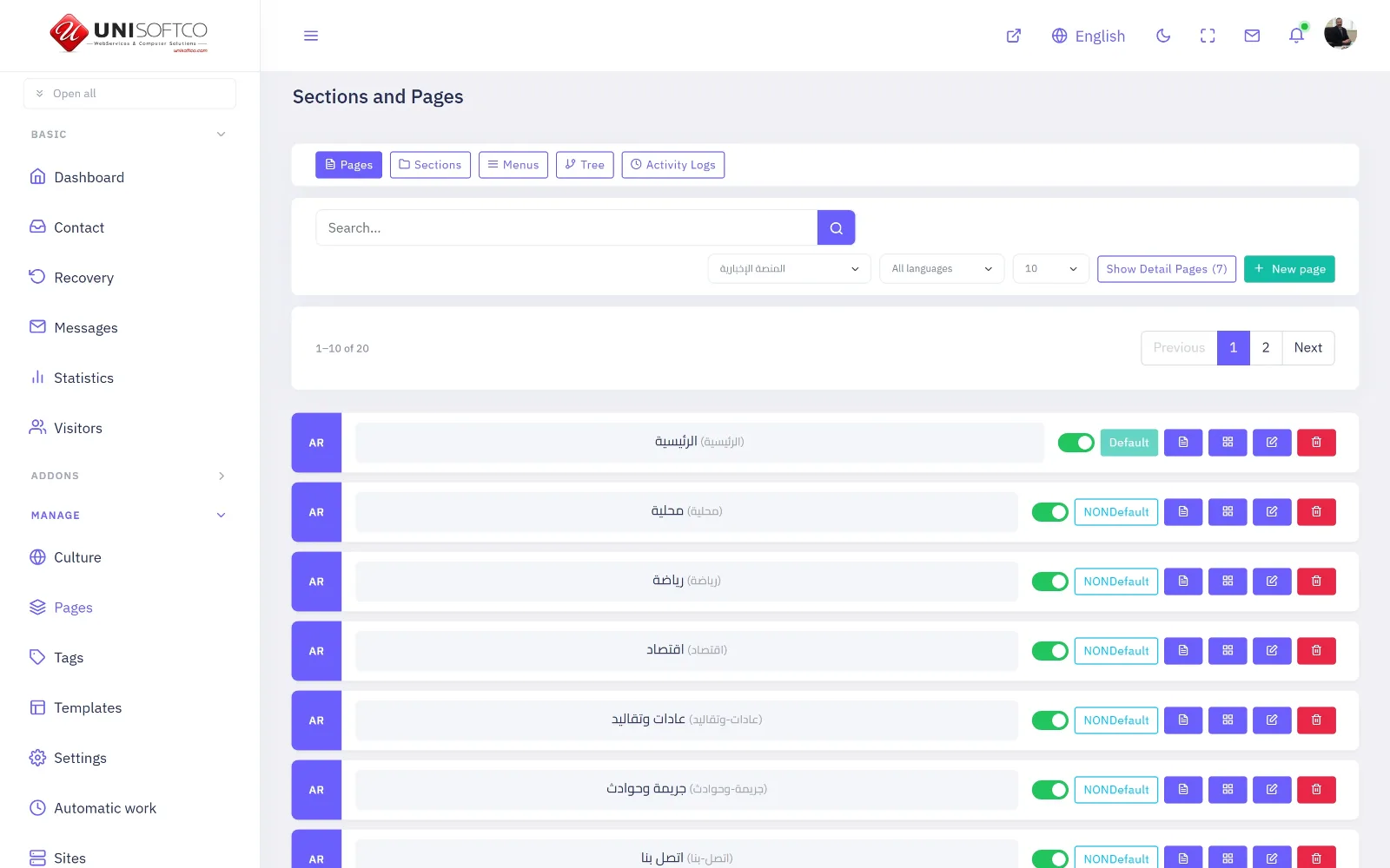
Everything is a placed component
A paragraph of text is a component. So is a photograph slider, a list of news, a contact form and a shopping basket. They are all put on a page by the same act, in the same place, by dragging them onto a preview of the page itself.
It sounds like a technical detail and it is the whole design. It means that the person who arranges the shop is the person who arranges the news, and neither of them writes code.
Zones
A layout offers places to put things — a full-width band across the top, the main content, and on some layouts a sidebar. Which zones exist depends on the layout you chose for that page.
Hide rather than delete
A component you do not want today has a switch. Use it. A placement is its settings — which category, how many, which design, which advertisement — and deleting it to clear a space throws all of that away. Hiding keeps it exactly as it was.
Menus and Nesting
Back to topThe address has two parts and cannot show nesting. The menu can, and it is what a reader sees.
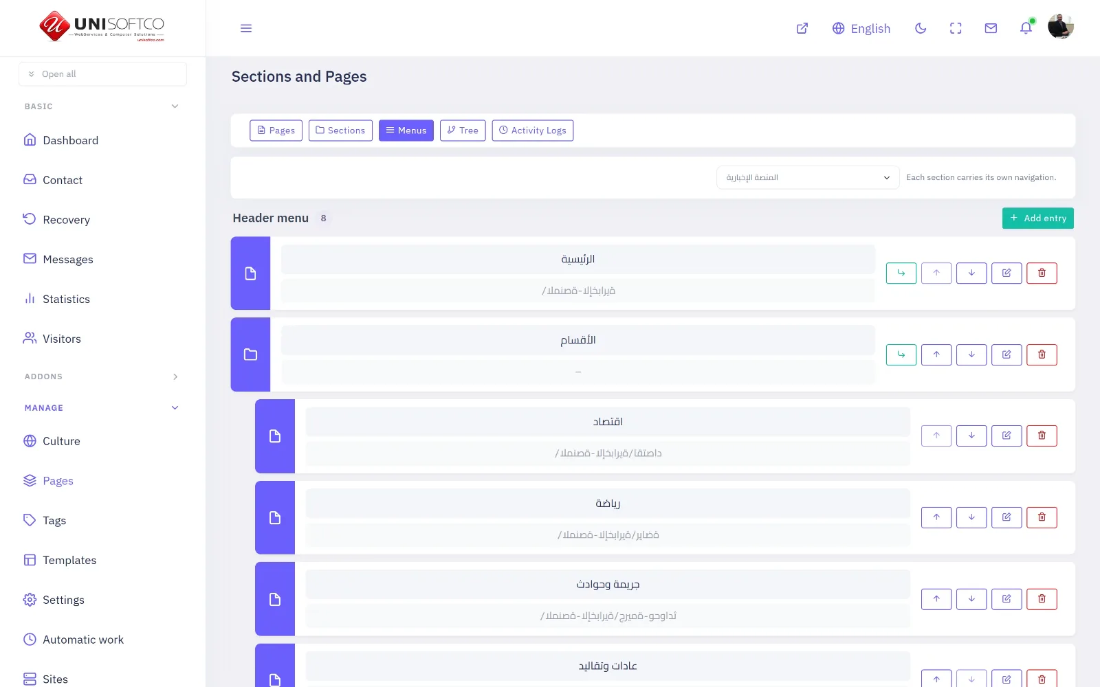
A menu item may point at three things
A page, an address of your own, or nothing at all. The third is not a mistake: an item with neither is a heading that opens the panel beneath it, which is how a large menu is organised.
A menu belongs to a section
Each section has its own header menu and its own footer menu, because each section is its own site. A section with no menu falls back to listing its own pages, which is enough until the day it is not.
Who sees an item
An item can be shown to everybody, only to somebody signed in, or only to somebody signed out. The third is what a "Sign in" link is for; the second is what an account page is for.
The designs
The five that ship, what each is for, and what changing between them costs.
The Five Designs
Back to topA newspaper, a shop, a magazine, a corporate site, and one of our own that draws everything.
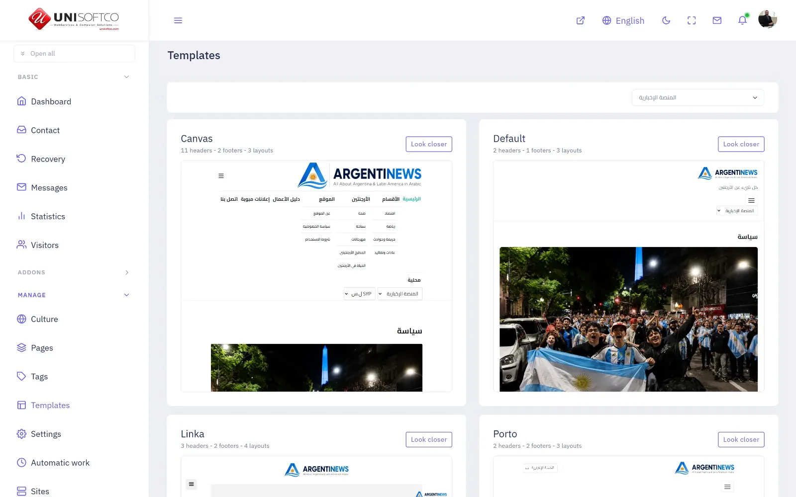
What each is for
sinmun is a newspaper: ten arrangements of a news list, an article page, categories, authors, tags, comments and a breaking strip. canvas is a shop, and also the most general of the bought designs. linka is a magazine. porto is a corporate site and a business directory. The default is ours, and it is the only one that draws every component the platform has.
A design declares what it cannot do
Each one says which families of component it can draw and which settings it will ignore, so the panel never offers you a control that would do nothing. If a design has no arrangement for a component, the panel does not offer that component on it — which is the only way to stop a page that answers correctly and shows nothing.
Changing design keeps your arrangement
A page holds a component by name, not by a link into the design, so changing a section from one design to another keeps every placement and every setting. What changes is how they are drawn.
Shop Catalogues
Back to topProducts, variants, several sellers, a basket and a checkout in four steps.
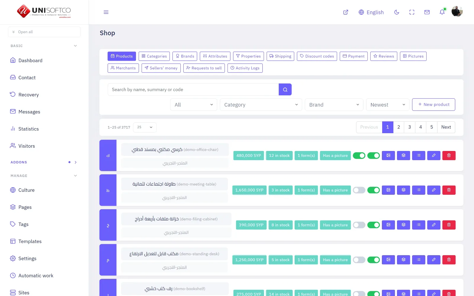
Two addons, on purpose
The shop owns what is being sold — products, forms of them, brands, stock, pictures, reviews. Commerce owns the money — one basket, one payment, one invoice. They are separate because the basket has to be able to hold a product, a promoted advertisement and an invoice at the same time and take one payment for all three.
A price is not required
A catalogue with no prices is a showroom, and the platform treats it as one: an item with no price says "ask about the price" and offers no button. Nothing has to be switched on for that.
What a buyer is asked, and in what order
The basket, then where it is going and by which carrier, then the address, then payment. A basket of things that do not ship has three steps instead of four, and only the last step ever submits an order.
Directory and Classifieds
Back to topCompanies with branches and opening hours; advertisements a member writes and somebody approves.
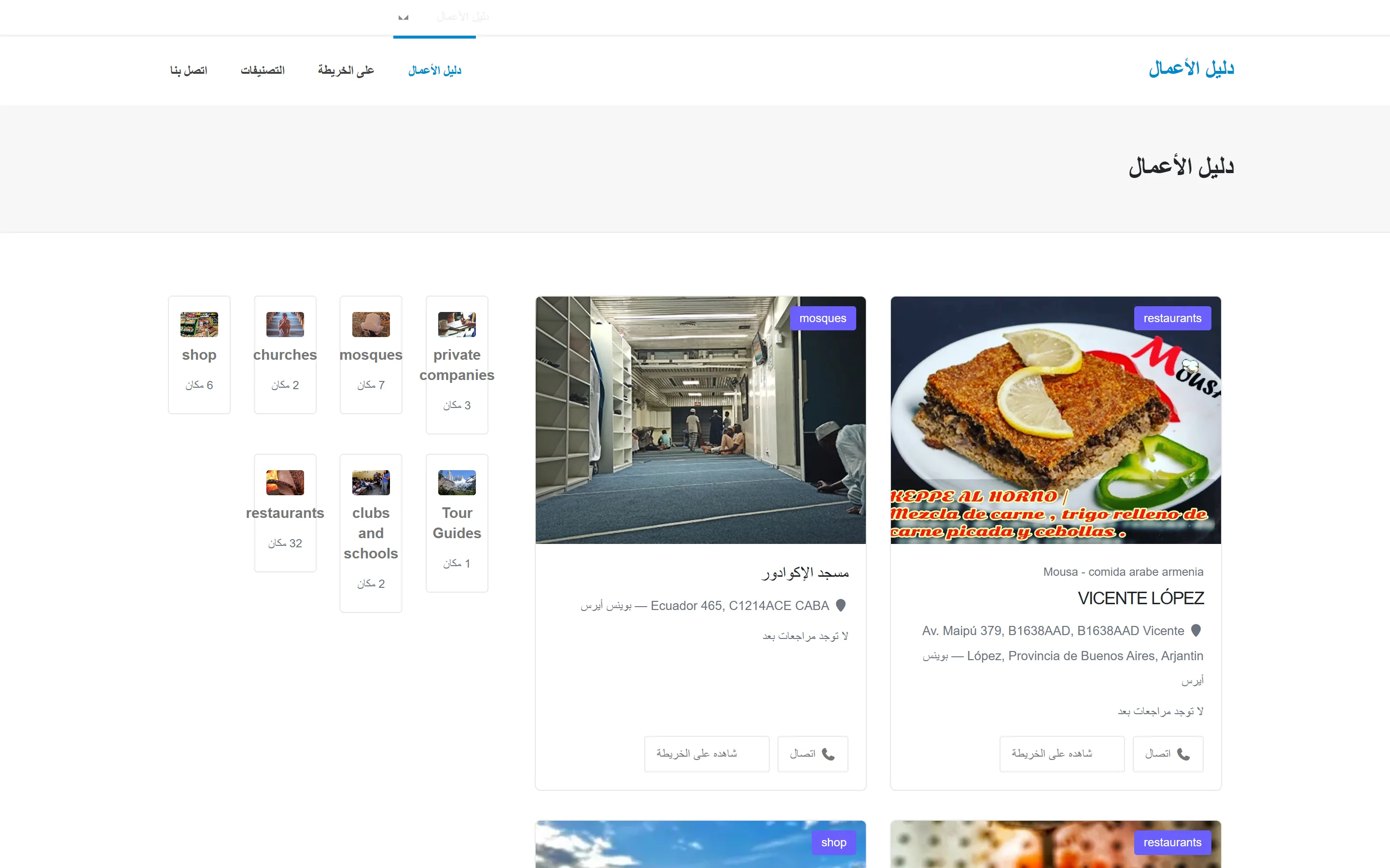
A directory entry is yours
You write it, it does not expire, and it holds what a company is: branches, opening hours with a state for "nobody has said", a map, a price list and reviews.
A classified is somebody else's
A member writes it, an administrator approves it before a stranger reads it, it has questions of its own per category — the year of a car, the rooms in a flat — and it ends. It ends in two different ways, and both matter: it expires on a date stamped when it was approved, and it can be marked sold, which is not the same fact.
Approving is where the work is
Refusing needs a reason, on both sides, because moderation without one is a black hole and the member simply posts it again tomorrow.
Running Classifieds
Back to topWhat a member may post, what expires, and where the questions come from.
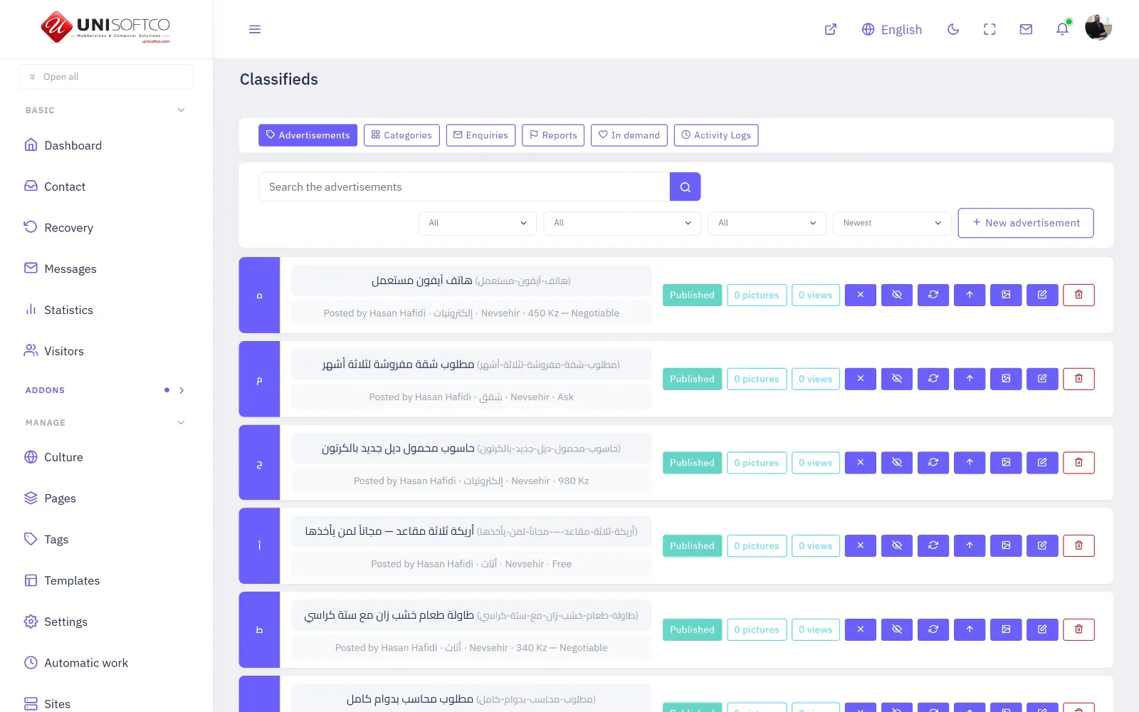
Questions belong to a category
A category declares its own questions, and the answer to a numeric one is stored as a number as well as text — which is the only reason a reader can ask for cars under a hundred thousand kilometres. You add categories and their questions yourself; nothing here is fixed in the program.
What "live" means
Published, not past its date, and its category still in use. All three, in one place, so the list, the category page, the advertisement's own address and the sitemap can never disagree about whether something is still showing.
A hidden telephone number is really hidden
When a poster asks for his number not to be shown, it is not merely left undrawn — it never leaves the server. A number sent to a browser is a number a scraper already has.
Anatomy of an Article
Back to topA headline, a lead, and a body made of parts — text, pictures, quotes, video and embeds.
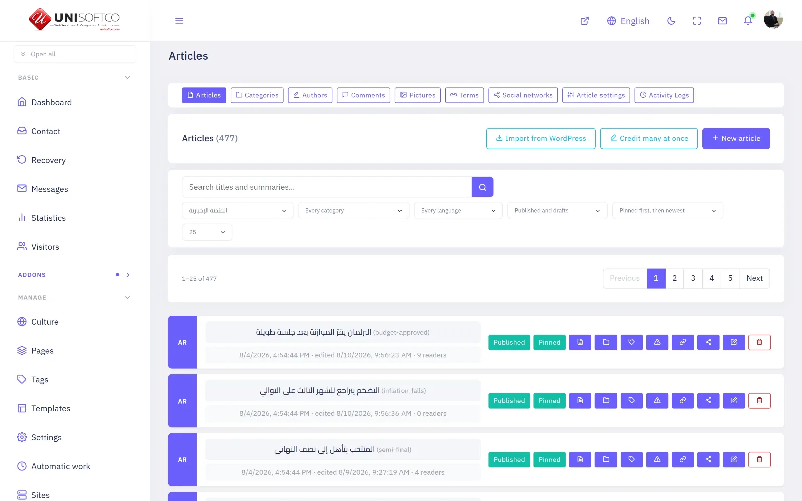
Parts, in order
Text, a picture with its own caption and its own credit, a quotation, a video, or something embedded from elsewhere. You add, reorder and remove them; the design decides how each is drawn.
A picture is required to appear in a list
This is deliberate and it surprises people. An article with no picture is never fetched for a list — not hidden, not unpublished, simply not asked for, because a block of cards with holes in it reads as broken however good the words are. Give it a picture and it appears everywhere immediately.
Publishing ahead of time
A date in the future means exactly that: the article is not live until then, everywhere, including in the feeds and the sitemap. It is one rule in one place rather than a check each screen has to remember.
Many sites
One server, several sites, and the manager that governs them.
Many Sites, One Server
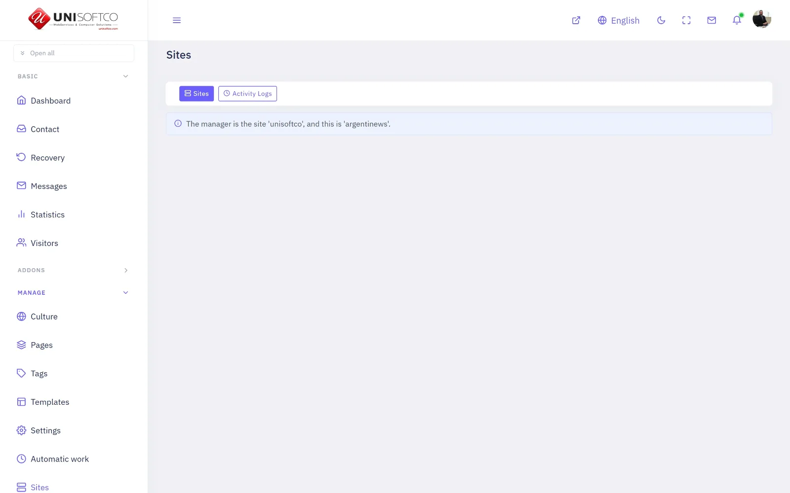
Back to topEach site has its own database, its own login to it, its own uploads and its own backups.
What is separate
Everything. Its own database. Its own login to that database, which cannot reach the databases beside it. Its own uploads folder. Its own backups. Nothing is shared and nothing is mixed.
What the manager can do — and what it cannot
One site is the manager. It says which address belongs to which site, whether a site answers at all, what it is called, and it creates new ones — a database, a login, the whole structure, the first administrator and a starting set of pages, in one act.
It cannot touch another site's content. There is no screen that edits another site's articles and no address that could. The manager writes to the register of sites and to nothing else.
A change does not need a restart
Every server re-reads the register every thirty seconds. Nothing is pushed at anybody, no list of servers is kept, and a server that was switched off while a change was made catches up simply by coming back.
Frequently asked
The questions people actually ask. It grows as they do.
Where do I start?
Back to topSections first, then a page, then something on the page.
Read Getting started above, in order. It is three pieces long and it is written as a course rather than as a reference — by the end of it you will have made a section, put a page in it and dragged something onto that page.
The rest of this handbook is a reference and can be read in any order, or searched with your browser's own find.
Why is my article not listed?
Back to topAlmost always the picture. A list refuses an article that has none.
Every list on this platform — a category page, the search, «more from this shelf» — asks for articles that have a picture, and skips the ones that do not. An article with no picture still answers perfectly at its own address; it simply cannot be found by browsing.
This is deliberate and it surprises people: a row of cards with holes in it reads as broken however good the words are. Give the article a picture and it appears everywhere at once.
Can I change the design later?
Back to topYes. A page keeps its arrangement when the design changes.
A page is a list of components in zones, and a design is a set of shapes for drawing them. Changing the design changes how the blocks are drawn, not which blocks are there.
What can change is the choice of SHAPE: a design that does not offer the particular shape you picked draws its own instead, and any setting the new design cannot use stops being offered in the composer rather than sitting there doing nothing.
What happens to my data if I leave?
Back to topOne button takes the whole site away as a single file. Nothing is deleted quietly.
Every site can be exported whole — its rows and its uploaded files — from Recovery. The file is yours and it is readable without this program.
An addon that lapses stops drawing and stops accepting new work; it does not delete what it held. The window is stamped on the site at the moment it lapses rather than read from a setting, so nobody can shorten it afterwards and take your data with it.
Do I need a developer?
Back to topNot for anything in this handbook.
Everything documented here is done from the panel: sections, pages, the components on them and their settings, the designs, the words in seven languages, the automatic work, the backups.
What still needs somebody technical is what is outside the program — pointing a domain at the server, and a payment provider's own keys.
How do I report a problem?
Back to topOpen a ticket. It is the top right of this page.
Use Open a Ticket above. A ticket carries which site you are on and who you are, so nobody has to ask you for either — and it stays on the record with its answer, which an email does not.
For anything that is not a fault — a question, an idea, an account matter — Contact Us is the same people and a shorter road.
Reference
Every component, setting, design and permission the program declares — written by the program itself, so it cannot fall behind it.
Accounting
Back to topA double-entry ledger — a chart of accounts, journal entries, customers and suppliers, invoices with their lines, payments with their bank references, and what each customer still owes.
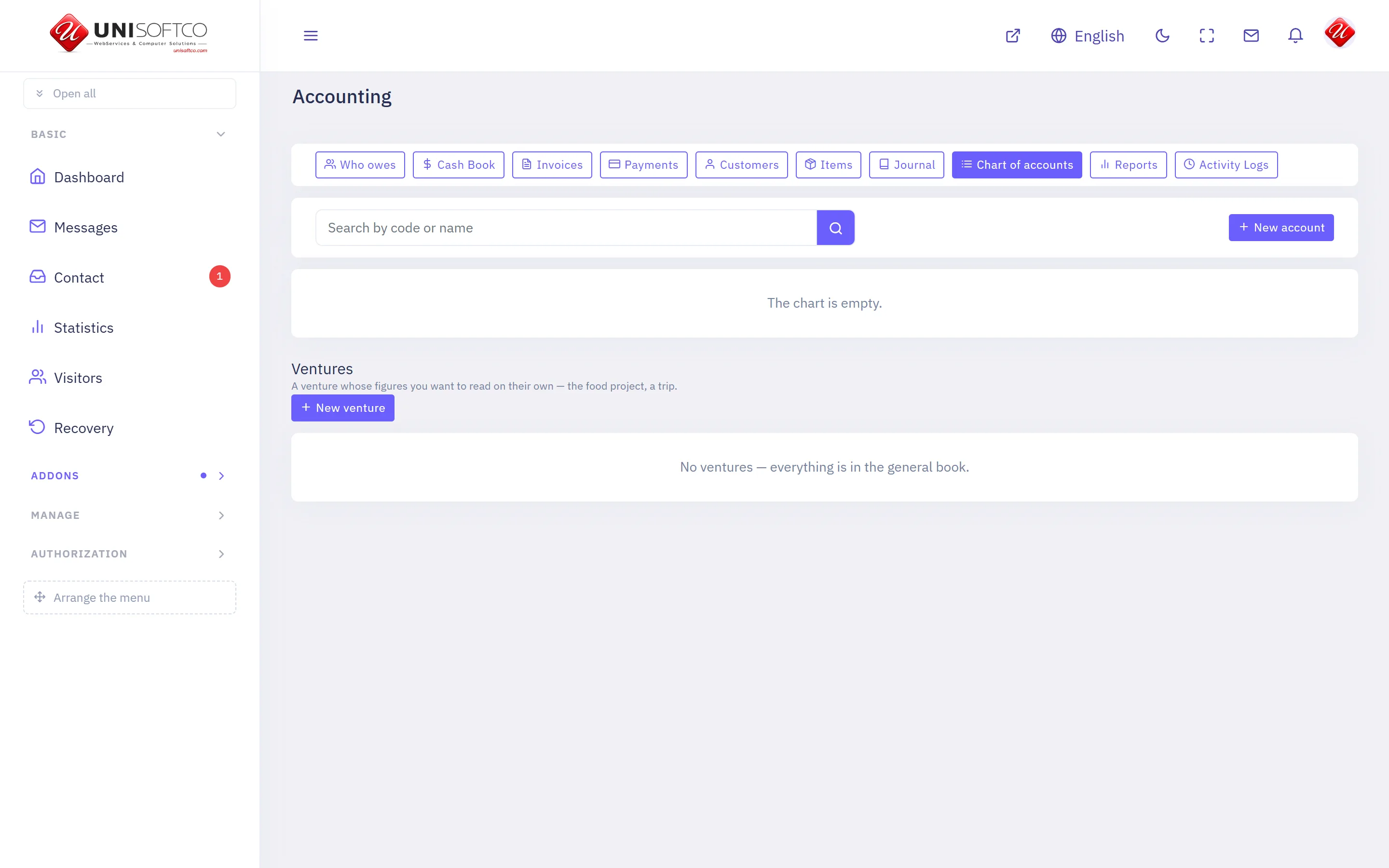
What it is
- Its key is Accounting, which is also the prefix of every component it owns.
- It is bought: a site has it only when the registry records that this customer bought it.
What it may be allowed to do
These are the permissions it declares. A person sees one of its screens only where his role carries the matching permission.
- accounting.manage
- accounting.post
- accounting.view
What it puts on a page
4 components, each of which can be dropped onto a page in the composer.
My account
What a signed-in customer owes, what he has paid, and the invoices behind both.
Placed as Accounting.MyAccount.
One setting:
- Show the payments he has made — a switch, left alone it is true.
My invoice
One of a signed-in customer's own invoices, with its lines and what has been paid.
Placed as Accounting.MyInvoice.
It takes no settings — it draws one way and has nothing to be told.
Pay this invoice
Lets a signed-in customer settle the invoice he is looking at. Goes on the invoice page.
Placed as Accounting.PayNow.
It takes no settings — it draws one way and has nothing to be told.
Price list
What the business sells and at what price, from the same rows its invoices use.
Placed as Accounting.PriceList.
2 settings:
- Show what each is counted in — a switch, left alone it is true.
- A heading above it — typed in.
Article Wire
Back to topPulls news from feeds, writes it up in your language, and holds it for review.
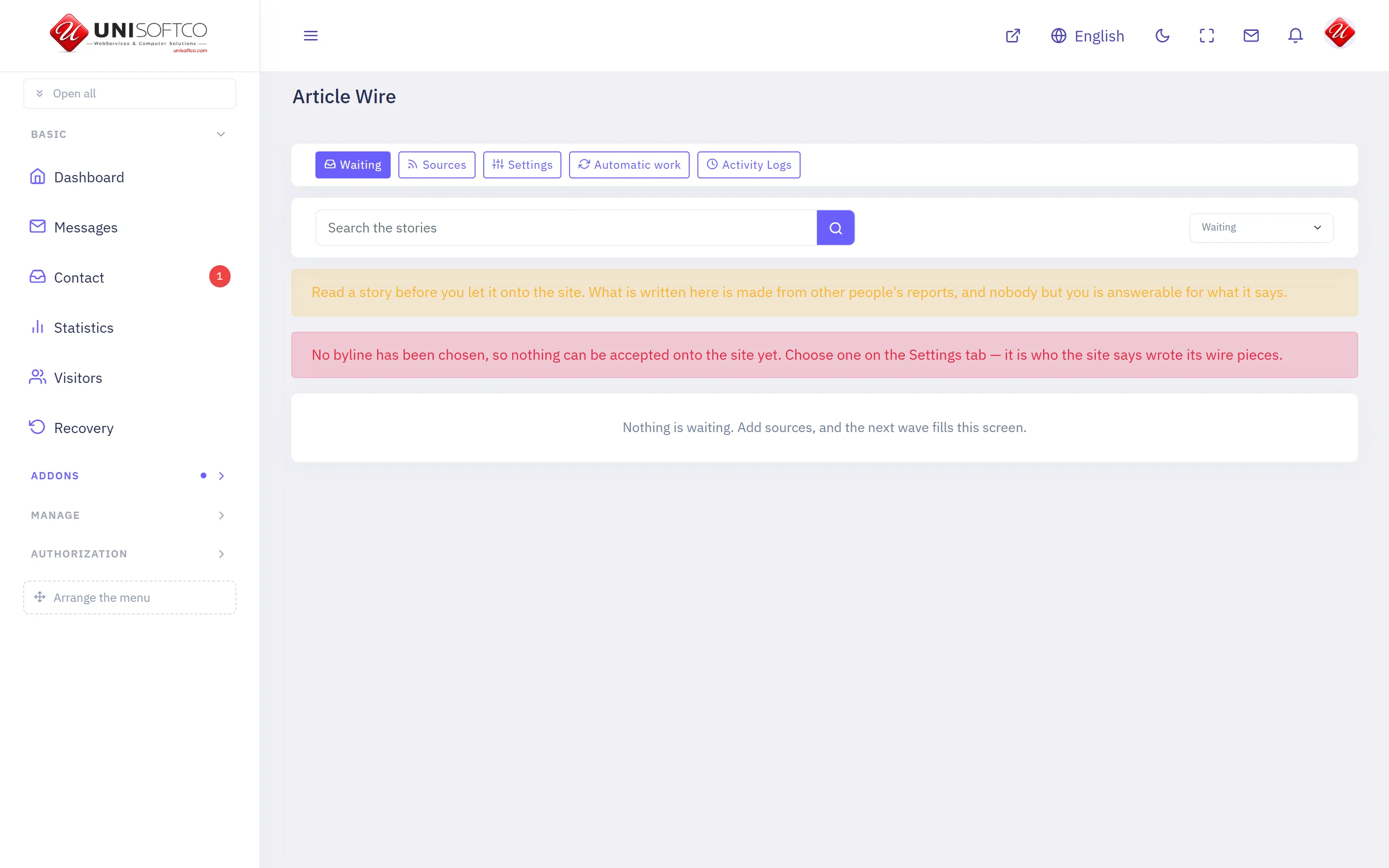
What it is
- Its key is ArticleWire, which is also the prefix of every component it owns.
- It is bought: a site has it only when the registry records that this customer bought it.
What it may be allowed to do
These are the permissions it declares. A person sees one of its screens only where his role carries the matching permission.
- articlewire.manage
- articlewire.publish
- articlewire.view
What it puts on a page
Nothing. This addon brings screens to the panel and no component to the page composer.
Articles
Back to topNews and articles, filed under categories.
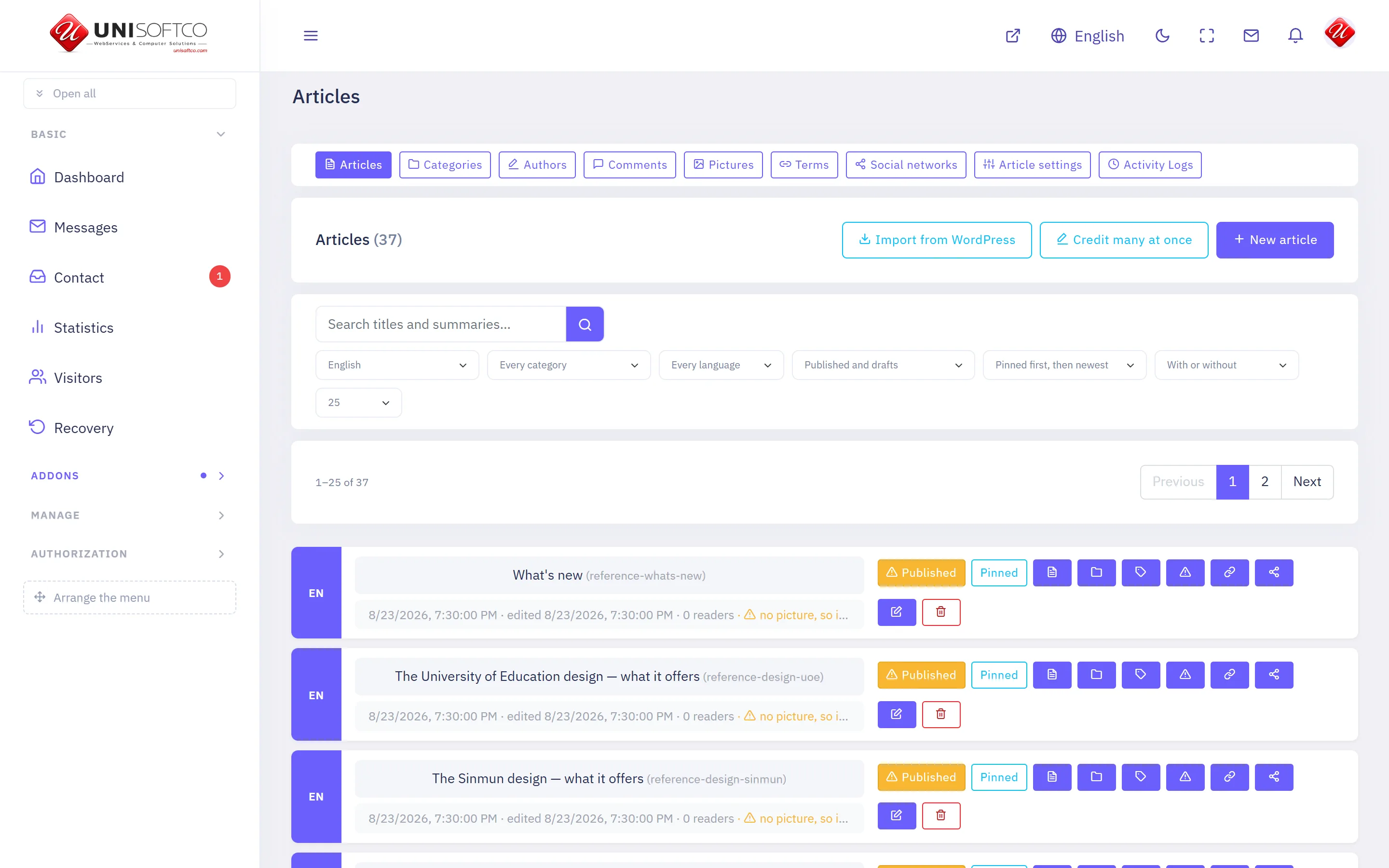
What it is
- Its key is Articles, which is also the prefix of every component it owns.
- It is bought: a site has it only when the registry records that this customer bought it.
What it may be allowed to do
These are the permissions it declares. A person sees one of its screens only where his role carries the matching permission.
- articles.manage
- articles.publish
- articles.setup
- articles.social
- articles.view
- articles.viewAll
What it puts on a page
12 components, each of which can be dropped onto a page in the composer.
Article
One article, opened from a list.
Placed as Articles.Detail.
9 settings:
- Show the main picture — a switch, left alone it is true.
- Show the summary — a switch, left alone it is true. The lead-in over the article, not the article itself.
- Show the date — a switch, left alone it is true.
- Show who wrote it — a switch, left alone it is true. Nothing is shown for an article with no author, whatever this says.
- Show the category — a switch, left alone it is true.
- Show how many have read it — a switch, left alone it is false. A number that is small early on is an argument against reading.
- Show how many have commented on it — a switch, left alone it is false. Counts only the comments that are visible on the site.
- Show the tags — a switch, left alone it is true.
- Show the sharing buttons — a switch, left alone it is true. Links a reader can press to send this article to WhatsApp, Telegram, Facebook, X or LinkedIn, or copy its address.
Article list
Articles from one category, newest first.
Placed as Articles.List.
17 settings:
- Category — chosen from a list this site's own data fills. Which category this list draws from.
- How many — a number, left alone it is 10. Between 1 and 50.
- How many across — a number, left alone it is 1. 1 is a list, 4 is canvas's news grid. A sidebar wants 1.
- Pages — chosen from No pager — just the newest few, Under the list, Above the list, Above and under it, One button — show more, left alone it is none. Above the list as well, when the list is long enough that its end is a scroll away.
- Include categories underneath — a switch, left alone it is true. A heading with everything filed under its children would otherwise show nothing.
- Show the summary — a switch, left alone it is true.
- Show the date — a switch, left alone it is true.
- Show the category — a switch, left alone it is true.
- Show who wrote it — a switch, left alone it is false. Nothing is shown for an article with no author, whatever this says.
- Also list the section's categories — a switch, left alone it is false. Only some designs draw them; the rest ignore it.
- Show how many have read it — a switch, left alone it is false.
- Show how many have commented on it — a switch, left alone it is false. Counts only the comments that are visible on the site.
- Order by — chosen from Newest first, Most read first, left alone it is newest.
- Most read of the last (days) — a number, left alone it is 0. 0 shows the most read since the site began. Any other number takes the pieces published in that many days and ranks them by the reads they had in those same days — so 7 is this week's most read, and the block moves on with the week instead of standing still on one old piece.
- Kind of piece — chosen from Ordinary articles, Video stories, Photograph albums. A video block should ask for video stories. Anything with the kind set but no video in it is left out, so the row never draws a play button over nothing.
- Start after — a number, left alone it is 0. Step over this many. A second list with no category set to the number the first shows carries on rather than repeating it.
- Skip what an earlier block already showed — a switch, left alone it is false. For a front page carrying several lists. The block above keeps the article and this one moves on to the next.
Author
Everything one author has written, opened from their byline.
Placed as Articles.Author.
6 settings:
- How many on a page — a number, left alone it is 12. Between 1 and 50.
- How many across — a number, left alone it is 3. 1 is a list, 3 is a grid.
- Show the summary — a switch, left alone it is true.
- Show the date — a switch, left alone it is true.
- Show how many have read it — a switch, left alone it is false.
- Show how many have commented on it — a switch, left alone it is false. Counts only the comments that are visible on the site.
Categories
The section's categories, linked to where each is shown.
Placed as Articles.Categories.
3 settings:
- How many — a number, left alone it is 10. Empty-handed categories are left out whatever this says.
- Order by — chosen from The order you arranged them in, Most articles first, left alone it is own.
- Show how many articles each has — a switch, left alone it is true.
Category
Every article in one category, opened from a link.
Placed as Articles.Category.
8 settings:
- How many on a page — a number, left alone it is 12. Between 1 and 50.
- How many across — a number, left alone it is 3.
- Include categories underneath — a switch, left alone it is true. A heading with everything filed under its children would otherwise show nothing.
- Pages — chosen from No pager — just the newest few, Under the list, Above the list, Above and under it, One button — show more, left alone it is bottom.
- Show the summary — a switch, left alone it is true.
- Show the date — a switch, left alone it is true.
- Show how many have read it — a switch, left alone it is false.
- Show how many have commented on it — a switch, left alone it is false. Counts only the comments that are visible on the site.
Comments
What readers wrote under this article, and the box to add one.
Placed as Articles.Comments.
2 settings:
- Ask for a rating — a switch, left alone it is false. A star out of five beside the box. Off for news, on for anything reviewed.
- Let readers reply to each other — a switch, left alone it is true.
Handbook
Every article on one long page, with a sidebar of anchors — the shape a manual is read in.
Placed as Articles.Handbook.
5 settings:
- The shelf it draws — chosen from a list this site's own data fills. Its children become the chapters. Left empty, every category here is one.
- Show the band at the top — a switch, left alone it is true. The title, the version and the date this was last touched.
- Where «Back to the site» goes — typed in, left alone it is /en. Left empty, the link is not drawn at all.
- Where «Open a Ticket» goes — typed in, left alone it is /en/support. Left empty, the link is not drawn at all.
- Where «Contact Us» goes — typed in, left alone it is /en/contact. Left empty, the link is not drawn at all.
Latest comments
The most recent things readers wrote, wherever you put it.
Placed as Articles.LatestComments.
2 settings:
- How many — a number, left alone it is 5.
- Say which article each is on — a switch, left alone it is true.
Map
Every article that shows a map, as a pin on one map.
Placed as Articles.Map.
7 settings:
- How many places at most — a number, left alone it is 400. A map of a whole country can carry hundreds; a block on a page usually wants fewer.
- Category — chosen from a list this site's own data fills. On a category page this is ignored unless the setting below is turned off.
- On a category page, map that category — a switch, left alone it is true. One placement then gives every category its own map, with nothing to keep in step.
- How tall, in pixels — a number, left alone it is 460.
- How far in it opens — a number. Left empty, it fits itself around the places it drew — which is almost always right.
- The filter row above the map — chosen from The other categories the pins carry, Every category the pins carry, No filter row, left alone it is others. «Others» drops the category the map is already narrowed to, which would select everything.
- Gather pins that overlap — a switch, left alone it is true. Forty sites in one governorate are one blot at country zoom without this.
News slider
The newest articles of one category, moving one after another.
Placed as Articles.Slider.
10 settings:
- Category — chosen from a list this site's own data fills. Which category the slider draws from.
- How many — a number, left alone it is 5. Between 1 and 12.
- Seconds on each — a number, left alone it is 6.
- Order — chosen from Newest first, Most read first, left alone it is latest.
- Most read of the last (days) — a number, left alone it is 0. 0 shows the most read since the site began. Any other number takes the pieces published in that many days and ranks them by the reads they had in those same days — so 7 is this week's most read, and the slider moves on with the week instead of standing still on one old piece.
- Include categories underneath — a switch, left alone it is true.
- Show the category — a switch, left alone it is true.
- Show the date — a switch, left alone it is true.
- Show the summary — a switch, left alone it is false. Off on a narrow slider, where a headline is all there is room for.
- Skip what an earlier block already showed — a switch, left alone it is false. Uses the next story instead, so one article is not on the page twice.
Story
A running story from its beginning — every piece, oldest first.
Placed as Articles.Story.
2 settings:
- How many to show — a number, left alone it is 50. Between 1 and 100.
- Show the summary — a switch, left alone it is true.
Tag cloud
The section's most used tags, each linking to what carries it.
Placed as Articles.Tags.
One setting:
- How many — a number, left alone it is 15.
Assistant
Back to topAn assistant that answers your visitors in your own site's words — in writing or by voice — and a record of what they asked for.
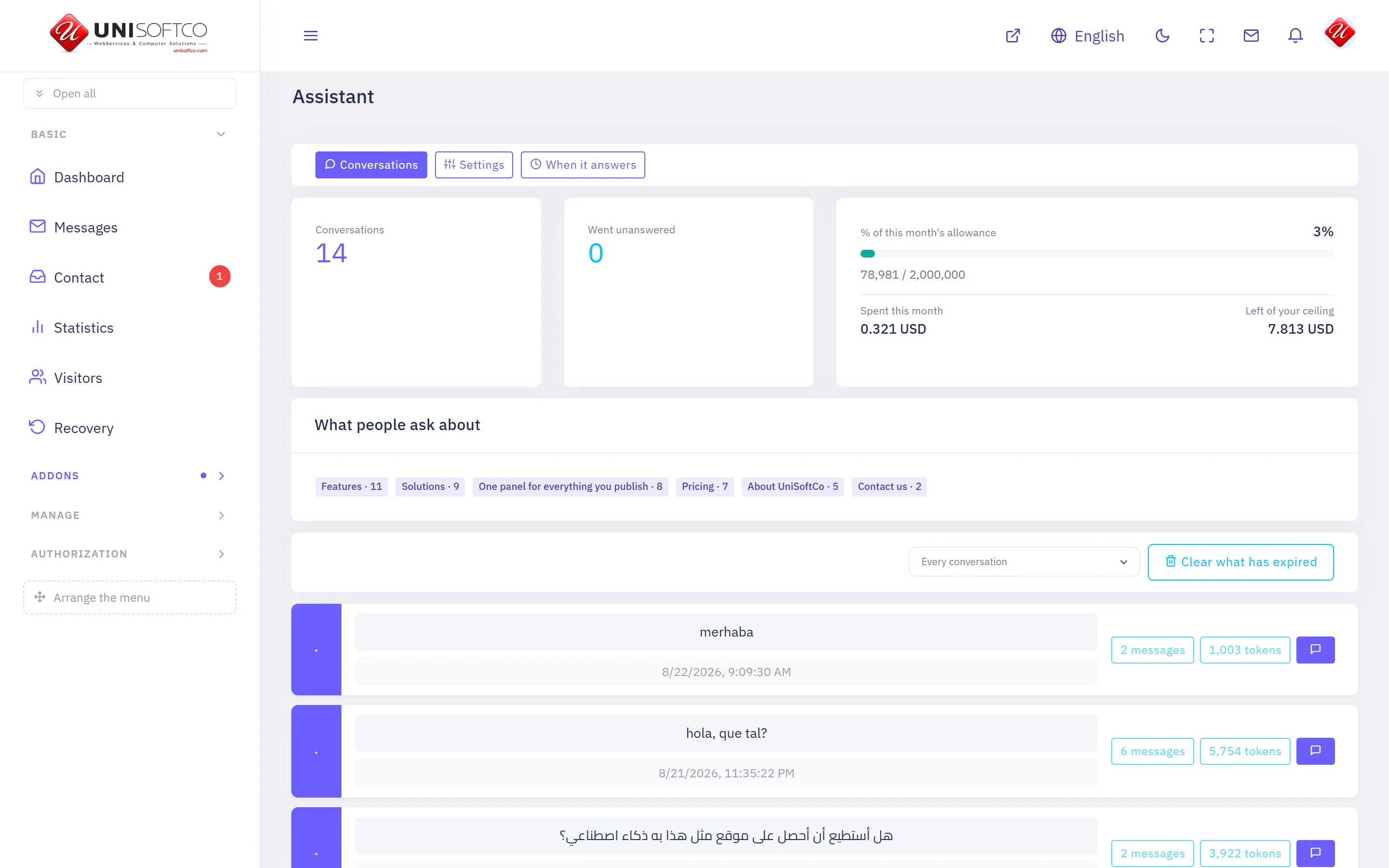
What it is
- Its key is Assistant, which is also the prefix of every component it owns.
- It is bought: a site has it only when the registry records that this customer bought it.
What it may be allowed to do
These are the permissions it declares. A person sees one of its screens only where his role carries the matching permission.
- assistant.manage
- assistant.view
What it puts on a page
One component, each of which can be dropped onto a page in the composer.
Assistant
A box your visitors can ask questions in.
Placed as Assistant.Chat.
4 settings:
- Greeting — typed in. The first line it says. Left empty, it simply waits.
- What the box says before anybody types — typed in.
- Open it as soon as the page loads — a switch, left alone it is false. A bubble that opens itself is one a visitor has to close. Off unless the page is about asking.
- Voice — chosen from Writing only, The browser's own voice, left alone it is off. The browser's own speech: nothing is uploaded and nothing is charged.
Authentication
Back to topSigning in, registering, and recovering a password.
What it is
- Its key is Authentication, which is also the prefix of every component it owns.
- It is free: every site on this platform has it, and no entitlement can take it away.
What it puts on a page
5 components, each of which can be dropped onto a page in the composer.
Forgot password
Asks for the email, and sends a link to set a new password.
Placed as Authentication.ForgotPassword.
It takes no settings — it draws one way and has nothing to be told.
Register
The form a visitor becomes a member with.
Placed as Authentication.SignUp.
It takes no settings — it draws one way and has nothing to be told.
Reset password
Sets a new password from the link in the email.
Placed as Authentication.ResetPassword.
It takes no settings — it draws one way and has nothing to be told.
Sign in
The form a member signs in with.
Placed as Authentication.SignIn.
It takes no settings — it draws one way and has nothing to be told.
Sign in and register
Both forms on one page, for a template drawn that way.
Placed as Authentication.SignInSignUp.
It takes no settings — it draws one way and has nothing to be told.
Basic
Back to topThe components every site starts with.
What it is
- Its key is Basic, which is also the prefix of every component it owns.
- It is free: every site on this platform has it, and no entitlement can take it away.
What it may be allowed to do
These are the permissions it declares. A person sees one of its screens only where his role carries the matching permission.
- ads.manage
- ads.view
- banners.manage
- banners.view
- contact.manage
- contact.view
- downloads.manage
- downloads.view
- folders.manage
- folders.view
- sliders.manage
- sliders.view
What it puts on a page
9 components, each of which can be dropped onto a page in the composer.
Advertisements
Code from an advertising network, run where you place it.
Placed as Basic.Ads.
2 settings:
- Slot — chosen from a list this site's own data fills. Which advertisements this runs. Change the slot, not the page.
- How many — a number, left alone it is 1. Most networks want one unit per place on a page.
Banner
A set of pictures, shown one after another where you place it.
Placed as Basic.Banner.
3 settings:
- Set — chosen from a list this site's own data fills. Which banners this draws. Change the set, not the page.
- How many — a number, left alone it is 5.
- Draw the banner's words on the picture — a switch, left alone it is true. Turn this off where the picture already carries its own words.
Cancelling a purchase
The «botón de arrepentimiento» Argentine law asks for: a buyer says he has changed his mind, gets a reference and a receipt by e-mail, and the request lands on the Revocations screen.
Placed as Basic.Revocation.
One setting:
- Ask for the captcha — a switch, left alone it is true. Off, a script can post through this form as fast as it likes.
Contact us
How to reach this section, with a form for writing to it.
Placed as Basic.Contact.
4 settings:
- Show the contact details — a switch, left alone it is true. The phone numbers, addresses and profiles set on the section.
- Show the message form — a switch, left alone it is true.
- Ask for the captcha — a switch, left alone it is true. Off, a script can post through this form as fast as it likes.
- Show the map — a switch, left alone it is false. Needs the section's latitude and longitude.
Files
A set of files a visitor may download.
Placed as Basic.Downloads.
2 settings:
- Which set of files — chosen from a list this site's own data fills. Which files this offers. Change the set, not the page.
- Show how large each file is — a switch, left alone it is true. Worth keeping on: somebody on a telephone is deciding whether to start.
Member details
One member's public profile, reached by their username.
Placed as Basic.Member.
It takes no settings — it draws one way and has nothing to be told.
Page title
A band with the page's name, and where it sits.
Placed as Basic.PageTitle.
2 settings:
- Heading — typed in. Left empty, the page's own title is used — which is what it should usually be.
- Show where the page sits — a switch, left alone it is true. The line under the heading: the section, and the category on an article.
Slider
A set of pictures that moves by itself, one after another.
Placed as Basic.Slider.
4 settings:
- Set — chosen from a list this site's own data fills. Which slides this draws. Change the set, not the page.
- How many — a number, left alone it is 5.
- Seconds on each — a number, left alone it is 6.
- Show the words over the picture — a switch, left alone it is true. Off draws the pictures alone, for a set whose words are already in them.
Text
A block of text you write yourself.
Placed as Basic.Html.
One setting:
- Show the block's name as a heading — a switch, left alone it is true.
Business Directory
Back to topCompanies and their branches on a map, with opening hours, photographs, products and reviews from registered members.
What it is
- Its key is Businesses, which is also the prefix of every component it owns.
- It is bought: a site has it only when the registry records that this customer bought it.
What it may be allowed to do
These are the permissions it declares. A person sees one of its screens only where his role carries the matching permission.
- businesses.manage
- businesses.moderate
- businesses.setup
- businesses.view
What it puts on a page
5 components, each of which can be dropped onto a page in the composer.
Business categories
What the directory is made of, as a way in to the places.
Placed as Businesses.Categories.
4 settings:
- Under which category — chosen from a list this site's own data fills. Left empty it draws the directory's main categories.
- How many across — a number, left alone it is 4.
- Show how many places each holds — a switch, left alone it is true.
- Show categories with nothing in them — a switch, left alone it is false. A category nobody has filed anything under is a promise the page cannot keep.
Business category page
One category's places, reached by its address.
Placed as Businesses.Category.
4 settings:
- How many places on a page — a number, left alone it is 24.
- Pages — chosen from No pager, Under the list, Above the list, Above and under it, One button — show more, left alone it is both.
- How many across — a number, left alone it is 3.
- Show the categories under it — a switch, left alone it is true.
Business list
Places in the directory, with their address and how to reach them.
Placed as Businesses.List.
7 settings:
- How many on a page — a number, left alone it is 12.
- Pages — chosen from No pager — just the first few, Under the list, Above the list, Above and under it, One button — show more, left alone it is none. Above the list as well, when the list is long enough that its end is a scroll away.
- How many across — a number, left alone it is 3.
- Category — chosen from a list this site's own data fills.
- Only the promoted ones — a switch, left alone it is false.
- Show the address — a switch, left alone it is true.
- Show the rating — a switch, left alone it is true.
Business map
The directory's places as pins on a map.
Placed as Businesses.Map.
7 settings:
- How many places — a number, left alone it is 200. A map of a whole city can carry hundreds; a block on a page usually wants fewer.
- Category — chosen from a list this site's own data fills.
- How tall, in pixels — a number, left alone it is 420.
- How far in it opens — a number. Left empty, it fits itself around the places it drew — which is almost always right.
- Offer "what is near me" — a switch, left alone it is true. The reader chooses whether to share where they are; nothing is asked until they press it.
- Show the categories above the map — a switch, left alone it is true.
- Gather pins that overlap — a switch, left alone it is true. Forty shops in one neighbourhood are one blot at city zoom without this.
Business page
One business in full, reached by its address.
Placed as Businesses.Detail.
5 settings:
- Show the opening hours — a switch, left alone it is true.
- Show the map — a switch, left alone it is true.
- Show the price list — a switch, left alone it is true.
- Show the reviews — a switch, left alone it is true.
- How many reviews — a number, left alone it is 10.
Classifieds
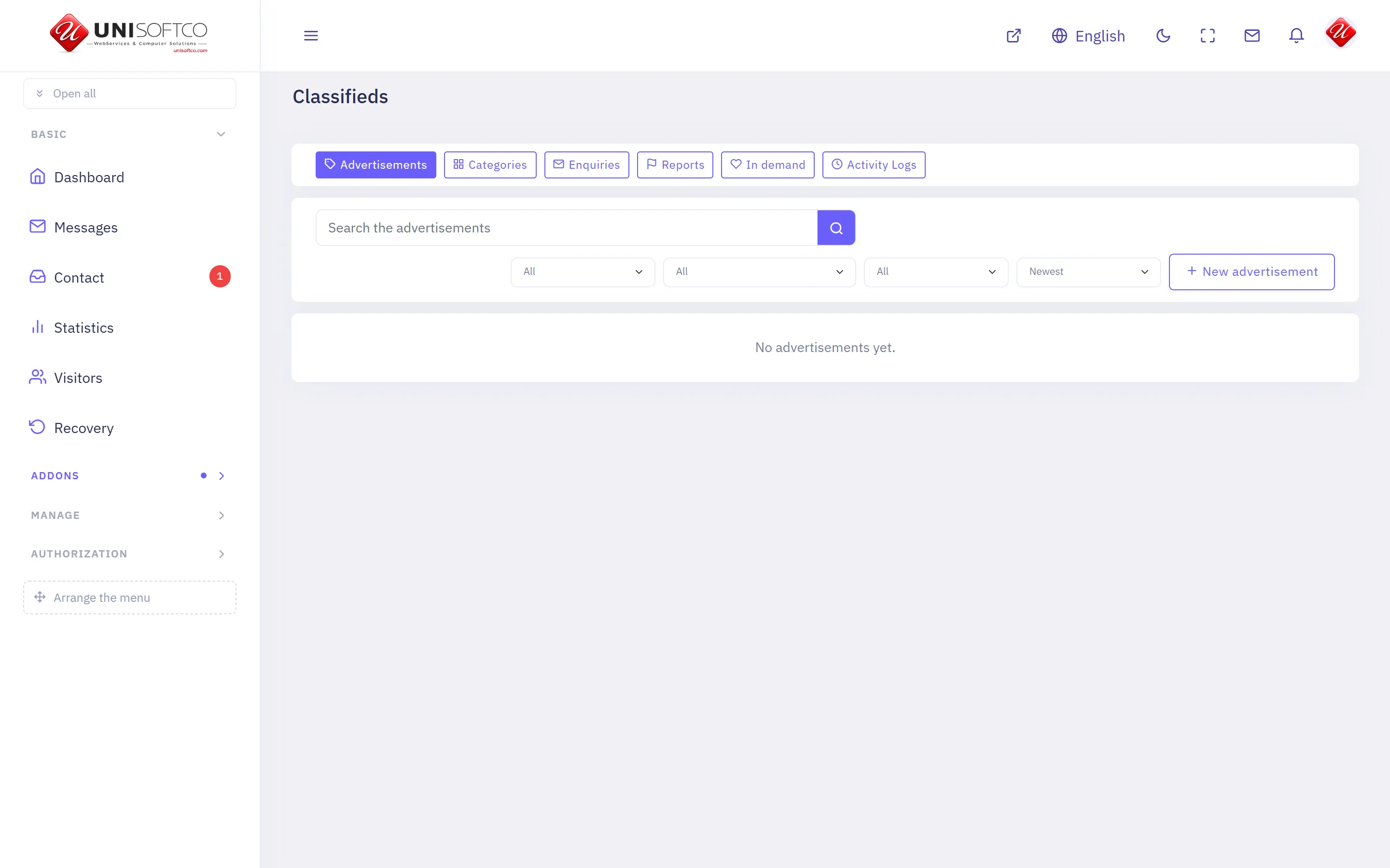
Back to topAdvertisements members post themselves — with a price, a place, pictures and a date they expire, reviewed before strangers see them.
What it is
- Its key is Classifieds, which is also the prefix of every component it owns.
- It is bought: a site has it only when the registry records that this customer bought it.
What it may be allowed to do
These are the permissions it declares. A person sees one of its screens only where his role carries the matching permission.
- classifieds.enquiries
- classifieds.manage
- classifieds.moderate
- classifieds.setup
- classifieds.view
What it puts on a page
5 components, each of which can be dropped onto a page in the composer.
Advertisement categories
What is advertised here, as a way in.
Placed as Classifieds.Categories.
4 settings:
- Under which category — chosen from a list this site's own data fills.
- How many across — a number, left alone it is 4.
- Show how many are in each — a switch, left alone it is true.
- Show categories with nothing in them — a switch, left alone it is false. A category nobody has advertised under is a promise the page cannot keep.
Advertisement category page
One category's advertisements, reached by its address.
Placed as Classifieds.Category.
3 settings:
- How many — a number, left alone it is 24.
- How many across — a number, left alone it is 3.
- Show the categories under it — a switch, left alone it is true.
Advertisement page
One advertisement in full, reached by its address.
Placed as Classifieds.Detail.
2 settings:
- Show who posted it — a switch, left alone it is true.
- Show the map — a switch, left alone it is true.
Advertisements
What members are offering, with the price and where it is.
Placed as Classifieds.List.
6 settings:
- How many — a number, left alone it is 12.
- How many across — a number, left alone it is 3.
- Category — chosen from a list this site's own data fills.
- Which kind — chosen from Offering, Looking for.
- Hide what has sold — a switch, left alone it is false. Left on, a sold listing still shows — it is what tells a reader things sell here.
- Show the price — a switch, left alone it is true.
Post an advertisement
The form a member writes an advertisement in, and his own advertisements.
Placed as Classifieds.Post.
One setting:
- Show the member his own advertisements — a switch, left alone it is true.
Commerce
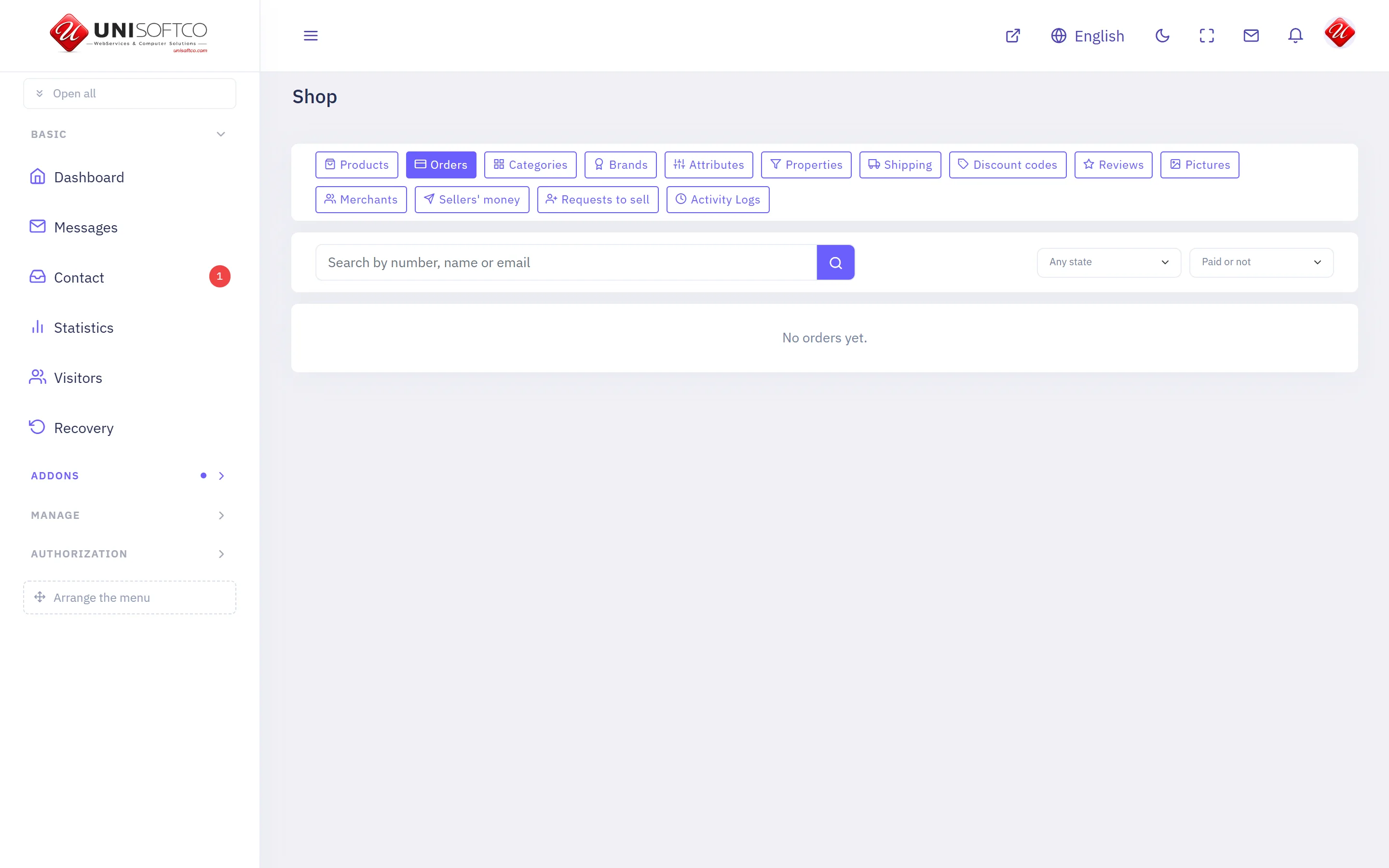
Back to topBaskets, orders and payments — the engine every catalogue sells through. One basket and one payment, whether it holds a product, a course or a promoted listing.
What it is
- Its key is Commerce, which is also the prefix of every component it owns.
- It is bought: a site has it only when the registry records that this customer bought it.
What it may be allowed to do
These are the permissions it declares. A person sees one of its screens only where his role carries the matching permission.
- commerce.manage
- commerce.refund
- commerce.view
What it puts on a page
4 components, each of which can be dropped onto a page in the composer.
Basket
What the visitor has put aside, and the way to pay for it.
Placed as Commerce.Cart.
One setting:
- Offer a way back to the shop — a switch, left alone it is true. Drawn only where the section actually has a shop page to go back to.
Checkout
The form that turns a basket into an order.
Placed as Commerce.Checkout.
2 settings:
- Ask for a telephone number — a switch, left alone it is true. Never required — a field somebody must fill in to buy is a field that loses buyers.
- Offer a place for a note — a switch, left alone it is true.
Currency
Lets a reader choose which currency he sees prices in.
Placed as Commerce.CurrencySwitcher.
One setting:
- Show the word beside it — a switch, left alone it is true. Off leaves the chooser alone, for a header with no room for a word.
Saved things
What a signed-in member has kept to come back to.
Placed as Commerce.Favourites.
2 settings:
- Show what each one costs — a switch, left alone it is true. Off leaves the list as names and pictures, for a site that is not a shop.
- Offer a basket button on each row — a switch, left alone it is true. Drawn only on a row that can actually be bought as things stand.
Courses
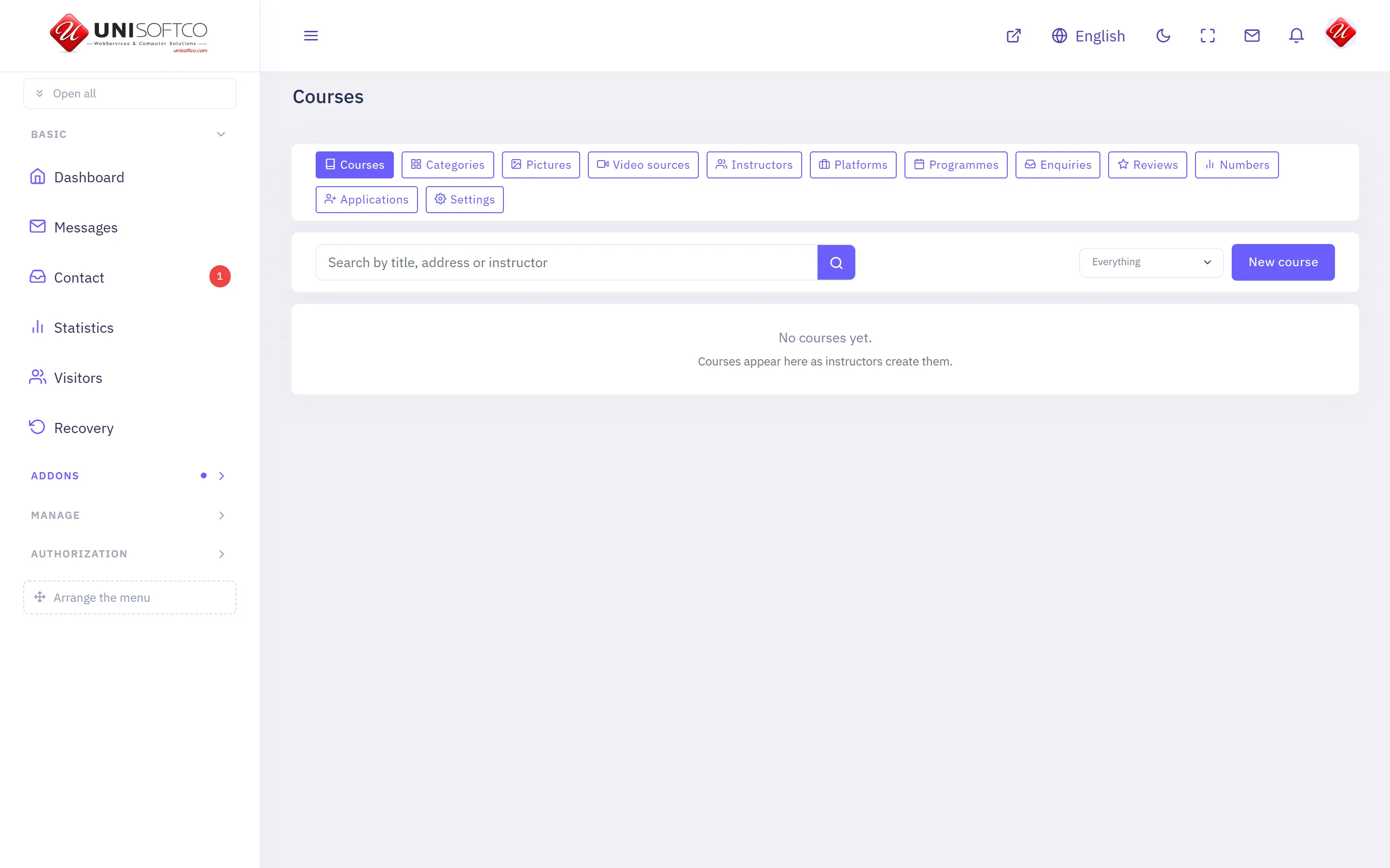
Back to topInstructors publish courses; students buy them, watch the lessons and earn a certificate. Sells through Commerce, so a basket may hold a course and anything else at once.
What it is
- Its key is Courses, which is also the prefix of every component it owns.
- It is bought: a site has it only when the registry records that this customer bought it.
What it may be allowed to do
These are the permissions it declares. A person sees one of its screens only where his role carries the matching permission.
- courses.manage
- courses.moderate
- courses.setup
- courses.view
What it puts on a page
10 components, each of which can be dropped onto a page in the composer.
Certificate
A finished course's certificate, printed and checked.
Placed as Courses.Certificate.
It takes no settings — it draws one way and has nothing to be told.
Course category
Every course on one shelf, opened from a link.
Placed as Courses.Category.
6 settings:
- How many per page — a number, left alone it is 12. Between 1 and 48.
- How many across — a number, left alone it is 3. Between 1 and 4.
- Include the shelves underneath — a switch, left alone it is true. A heading whose courses are all filed under its children would otherwise show none.
- Show the shelves underneath as links — a switch, left alone it is true.
- Show the classroom programmes on this shelf too — a switch, left alone it is true. A strip under the courses. Off on a site that runs no programmes — it draws nothing there anyway.
- Order — chosen from Newest first, By title, Cheapest first, left alone it is newest.
Course list
The catalogue as cards, with the browse filters.
Placed as Courses.List.
5 settings:
- How many per page — a number, left alone it is 12.
- How many across — a number, left alone it is 3. Between 1 and 4.
- Featured courses only — a switch, left alone it is false. For a home-page strip. The full catalogue page leaves it off.
- Strip mode — cards only — a switch, left alone it is false. Hides the browse bar and draws a heading and a more-link instead. For the home page.
- The strip's heading — typed in. Drawn above the cards in strip mode only.
Course page
One course: the promise, the curriculum, the instructor, the price.
Placed as Courses.Detail.
It takes no settings — it draws one way and has nothing to be told.
Course player
Where a student watches what he bought, and marks his way through it.
Placed as Courses.Learn.
It takes no settings — it draws one way and has nothing to be told.
Courses hero banner
The home page's opening: a line, a course search, the subjects as cards.
Placed as Courses.Hero.
3 settings:
- The big line — typed in. Empty draws the section's own title.
- The line under it — typed in.
- How many subject cards — a number, left alone it is 8. Between 1 and 12. The busiest shelves come first.
My courses
A member's enrollments and how far he has come.
Placed as Courses.MyCourses.
It takes no settings — it draws one way and has nothing to be told.
Programme page
One classroom programme: the promise, the objectives, the outline.
Placed as Courses.Program.
It takes no settings — it draws one way and has nothing to be told.
Teach on this site
A member asks to become one of the site's instructors.
Placed as Courses.TeachWithUs.
It takes no settings — it draws one way and has nothing to be told.
Training programmes
Classroom programmes as cards, with the browse filters.
Placed as Courses.Programs.
2 settings:
- How many per page — a number, left alone it is 12. Between 1 and 48.
- Featured programmes only — a switch, left alone it is false. For a home-page strip. The full list leaves it off.
Mail Service
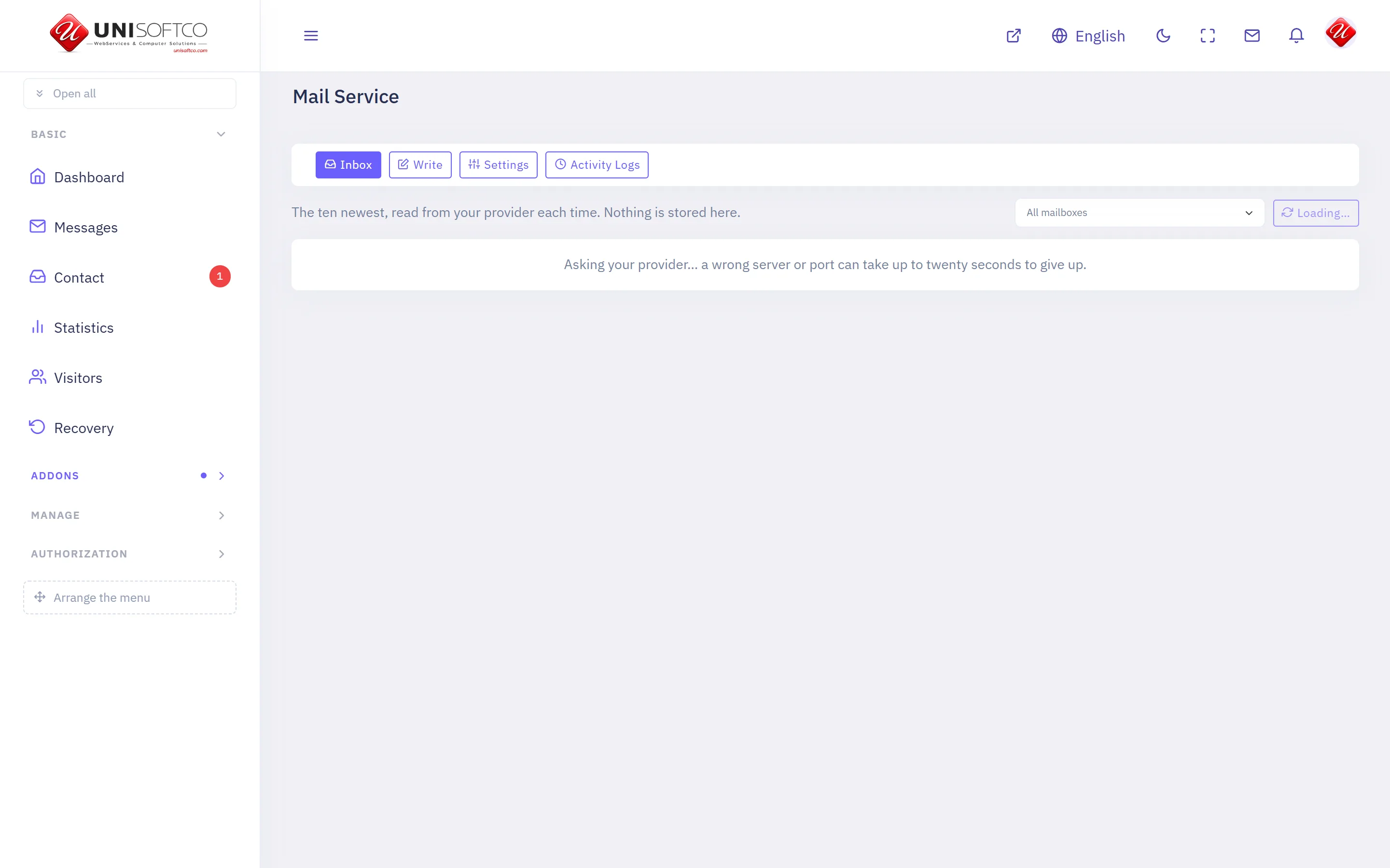
Back to topSend and read mail from your own address, inside the panel.
What it is
- Its key is Mail, which is also the prefix of every component it owns.
- It is bought: a site has it only when the registry records that this customer bought it.
What it may be allowed to do
These are the permissions it declares. A person sees one of its screens only where his role carries the matching permission.
- mail.manage
- mail.send
- mail.view
What it puts on a page
Nothing. This addon brings screens to the panel and no component to the page composer.
Mobile app
Back to topYour site as an application on a phone, with its own name, icon and colours.
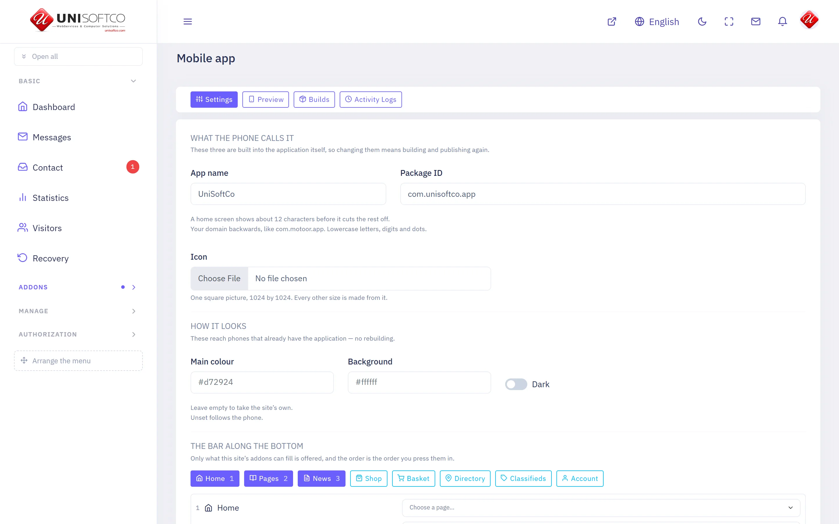
What it is
- Its key is MobileApp, which is also the prefix of every component it owns.
- It is bought: a site has it only when the registry records that this customer bought it.
What it may be allowed to do
These are the permissions it declares. A person sees one of its screens only where his role carries the matching permission.
- mobileapp.build
- mobileapp.manage
- mobileapp.view
What it puts on a page
One component, each of which can be dropped onto a page in the composer.
Get the app
Where a visitor can install this site's own application.
Placed as MobileApp.Download.
2 settings:
- Heading — typed in. Left empty, the block says «Get our app» in the reader's own language.
- Which application — typed in. The application's key — «news», «properties». Empty offers the site's default one.
Shop
Back to topProducts, the forms they come in, who sells them and for how much. Sells through Commerce, so a basket may hold a product and anything else at once.
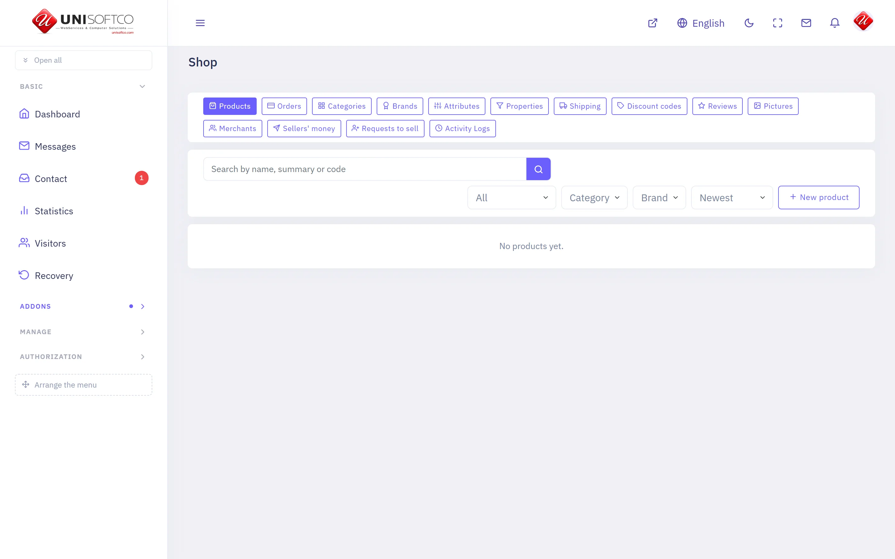
What it is
- Its key is Ecommerce, which is also the prefix of every component it owns.
- It is bought: a site has it only when the registry records that this customer bought it.
What it may be allowed to do
These are the permissions it declares. A person sees one of its screens only where his role carries the matching permission.
- ecommerce.manage
- ecommerce.moderate
- ecommerce.setup
- ecommerce.view
What it puts on a page
10 components, each of which can be dropped onto a page in the composer.
Category page
One category of the shop, reached by its address.
Placed as Ecommerce.Category.
4 settings:
- How many — a number, left alone it is 24.
- How many across — a number, left alone it is 4.
- Show what is inside it — a switch, left alone it is true.
- Only what can be bought — a switch, left alone it is false. Off shows everything published, which is what a showroom wants.
My shelf
What a merchant sells, what has sold, and what he is owed.
Placed as Ecommerce.MyShop.
2 settings:
- Show what has sold — a switch, left alone it is true. The paid lines behind his balance. Off leaves the totals without their detail.
- Show what has been sent him — a switch, left alone it is true.
Product page
One product in full, reached by its address.
Placed as Ecommerce.Detail.
4 settings:
- Show the brand — a switch, left alone it is true.
- Show the specification — a switch, left alone it is true.
- Say who is selling it — a switch, left alone it is false. Worth switching on where several merchants sell the same thing, and noise where one does.
- Reviews as a tab — a switch, left alone it is true. Switch it off if you also place the reviews block on the page.
Product slider
Products of one shelf, moving one after another.
Placed as Ecommerce.Slider.
9 settings:
- Shelf — chosen from a list this site's own data fills. Which shelf the slider draws from.
- Brand — chosen from a list this site's own data fills.
- How many — a number, left alone it is 5. Between 1 and 12.
- Seconds on each — a number, left alone it is 6.
- Only the promoted ones — a switch, left alone it is false.
- Only what can be bought — a switch, left alone it is false. Left off, everything published is shown and anything with no price says so.
- Show the price — a switch, left alone it is true.
- Show the summary — a switch, left alone it is true. Off on a short slider, where a name is all there is room for.
- Show the brand — a switch, left alone it is false.
Products
What the shop sells, with the price and what is left.
Placed as Ecommerce.List.
7 settings:
- How many — a number, left alone it is 8.
- How many across — a number, left alone it is 4.
- Category — chosen from a list this site's own data fills.
- Brand — chosen from a list this site's own data fills.
- Only the promoted ones — a switch, left alone it is false.
- Only what can be bought — a switch, left alone it is false. Left off, everything published is shown and anything with no price says so. Switch it on for a shop that takes money, so nothing unbuyable reaches the front page.
- Show the brand — a switch, left alone it is true.
Products, filtered
The shop with category, brand and characteristics down the side.
Placed as Ecommerce.Filter.
4 settings:
- How many on a page — a number, left alone it is 12.
- How many across — a number, left alone it is 3.
- Start inside — chosen from a list this site's own data fills. Narrows the page to one branch of the catalogue before the reader chooses anything. Leave it empty and he starts with everything.
- Only what can be bought — a switch, left alone it is false. Left off, everything published is filtered and anything with no price says so.
Reviews
What buyers said about the product on this page.
Placed as Ecommerce.Reviews.
One setting:
- How many to show — a number, left alone it is 10.
Sell on this site
A member asks to become one of the shop's merchants.
Placed as Ecommerce.SellWithUs.
One setting:
- Ask for a telephone number — a switch, left alone it is true. Never required either way — a member who would rather not give one still asks.
Seller page
Who a seller is and what he has for sale.
Placed as Ecommerce.Merchant.
2 settings:
- How many of his products to show — a number, left alone it is 12.
- How many across — a number, left alone it is 4.
Shop categories
What the shop is made of, as tiles.
Placed as Ecommerce.Categories.
4 settings:
- How many across — a number, left alone it is 4.
- Inside — chosen from a list this site's own data fills.
- Show how many are in each — a switch, left alone it is true.
- Count only what can be bought — a switch, left alone it is false. Leave it as the shop's list and its category pages have it, or the number on a tile will not match what opens behind it.
Site manager
Back to topEvery site this server carries: what it is called, where it answers, and whether it is running.
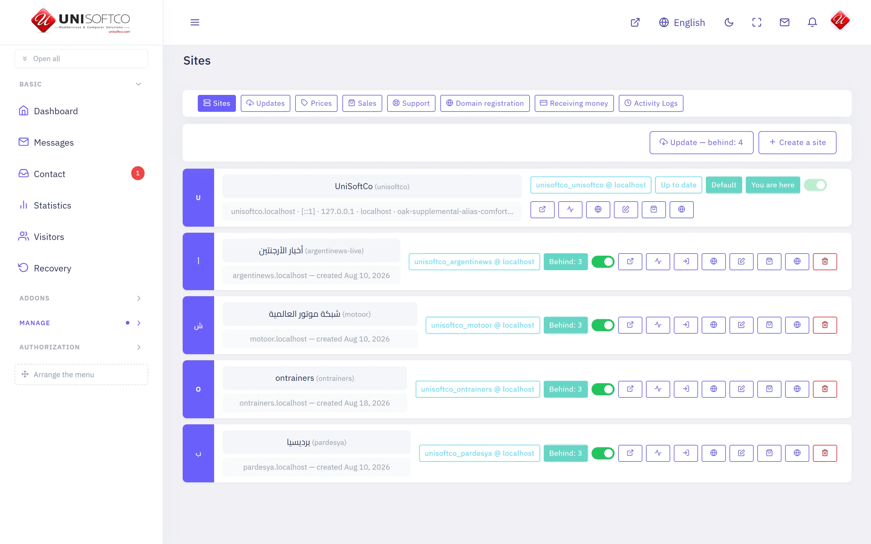
What it is
- Its key is Management, which is also the prefix of every component it owns.
- It is free: every site on this platform has it, and no entitlement can take it away.
- It is the manager's own, and never appears on a customer's site whatever he bought.
What it may be allowed to do
These are the permissions it declares. A person sees one of its screens only where his role carries the matching permission.
- management.create
- management.manage
- management.remove
- management.view
What it puts on a page
8 components, each of which can be dropped onto a page in the composer.
Buy from this platform
Four panels a visitor buys through: where to start, what he wants, who he is, and how he pays. A website is handed over the moment it is paid for; a server is promised the time set in the prices tab.
Placed as Management.Buy.
10 settings:
- Which of the two it offers — chosen from Websites and servers, side by side, Websites only, Servers only, left alone it is both. One of the two fills the width on its own — there is no empty column beside it.
- Which server plans it shows — chosen from The first one, as a single offer, All of them, to choose from, left alone it is first. With one plan the two are the same. The row of cards is drawn only where there is more than one.
- The line above the first panel — typed in. Left empty, it says «Start here» in the reader's own language.
- The line under it — typed in. Left empty, it says «Pay for what you want and have it at once» in the reader's own language.
- The second box: its heading — typed in. Left empty, it says «Get an app in minutes» in the reader's own language.
- The second box: the line under it — typed in. Left empty, it explains in the reader's own language that the site becomes a phone application.
- The second box: where its button goes — typed in. An address on this site, taken from its own menu. A page that exists but is not published answers 404, so open the link once after saving. Left empty, the box is drawn without a button.
- The third box: its heading — typed in. Left empty, it says «More than 25 years in technology» in the reader's own language.
- The third box: the line under it — typed in. Left empty, it says in the reader's own language what this company builds.
- The third box: where its button goes — typed in. An address on this site, taken from its own menu — the same rule as the second box above. Left empty, the box is drawn without a button.
Is this domain free
A box a visitor types a domain into. Says whether this platform already answers at it, and whether it is registered in the world.
Placed as Management.DomainSearch.
2 settings:
- The line above the box — typed in. Left empty, the box stands on its own.
- What the empty box says — typed in, left alone it is example.com.
The designs a site can wear
Every design this build carries and what each one can draw. It reads the catalogue rather than a written list, so a design added tomorrow appears without anybody editing the page.
Placed as Management.Designs.
2 settings:
- The heading above the designs — typed in. Left empty, it says «Choose how it looks» in the reader's own language. A single space draws no heading at all.
- The sentence under the heading — typed in. Left empty, it draws the phrase. A single space draws nothing.
The languages this site speaks
Every language switched on for this site, in its own script. It reads the site's own rows, so a language added in the panel appears here without anybody editing the page.
Placed as Management.Languages.
3 settings:
- The heading above the languages — typed in. Left empty, it says «Eight languages, one panel» in the reader's own language — with the real number. A single space draws no heading at all.
- The sentence under the heading — typed in. Left empty, it draws the phrase. A single space draws nothing.
- Show the flags — a switch, left alone it is true. Draws each language's flag beside its name, where the deployment has the flag files. Names alone where it has not.
Ways you can be paid
A strip of the payment methods this site has switched on, for the foot of a page. It draws what the payment settings actually carry, so it cannot promise a gateway nobody has keyed.
Placed as Management.PaymentMarks.
2 settings:
- The line above the marks — typed in. Left empty, it says «Ways you can pay» in the reader's own language. A single space draws no line at all.
- Show the card marks as well — a switch, left alone it is true. Visa, Mastercard and American Express, beside the gateways that take them. Off where a site is paid only by transfer.
What he has with us
A signed-in customer's own sites: where each answers, whether it is serving, and when it next has to be paid for. A stranger is asked to sign in.
Placed as Management.MySites.
One setting:
- The line above the list — typed in. Left empty, the list stands on its own.
What the platform can be
Every addon this build carries, with what each one does. It reads the build rather than a written list, so an addon added tomorrow appears without anybody editing the page.
Placed as Management.Addons.
3 settings:
- The heading above the list — typed in. Left empty, it says «What your site can be» in the reader's own language. A single space draws no heading at all.
- The sentence under the heading — typed in. Left empty, it draws the phrase. A single space draws nothing.
- Mark the ones included free — a switch, left alone it is true. A small word on the addons every site gets without paying for them.
Write to support
A form a signed-in member uses to tell us something is wrong. A stranger is asked to sign in rather than shown a box that will not send.
Placed as Management.Support.
2 settings:
- The line above the form — typed in. Left empty, the form stands on its own.
- Show him what he has already sent — a switch, left alone it is true. His own tickets and the answers to them, under the form.
The Academ design
Back to topThe shapes, the chrome and the layouts the Academ design declares.
What it can draw
A design draws only the families it declares. One that does not name an addon simply has no components for it — a news template has no shop.
- Assistant
- Authentication
- Basic
- Commerce
- Courses
Its top and its bottom
2 headers to choose between:
- Mark, menu and controls
- No header
2 footers to choose between:
- Contacts, a menu and a green strip
- No footer
The shapes it offers
Where a component can be drawn more than one way, these are the shapes this design offers and what each is for.
Assistant.Chat
- In the page
Basic.Slider
- The original slider
How a page can be divided
A layout is how one page is divided. Every one of them has a band above the page and an area under it, whatever happens in the middle.
One column
- Above the page — 12 of twelve wide
- Content — 12 of twelve wide
- Under the page — 12 of twelve wide
Content with a column beside it
- Above the page — 12 of twelve wide
- Content — 8 of twelve wide
- Beside it — 4 of twelve wide
- Under the page — 12 of twelve wide
A column, then the content
- Above the page — 12 of twelve wide
- Content — 8 of twelve wide
- Beside it — 4 of twelve wide
- Under the page — 12 of twelve wide
The Canvas design
Back to topThe shapes, the chrome and the layouts the Canvas design declares.

What it can draw
A design draws only the families it declares. One that does not name an addon simply has no components for it — a news template has no shop.
- Accounting
- Articles
- Assistant
- Authentication
- Basic
- Commerce
- Courses
- Ecommerce
- Management
Its top and its bottom
12 headers to choose between:
- Light
- Dark
- Top bar, boxed
- Transparent dark
- Semi-transparent
- Semi-transparent dark
- Masthead
- Top bar, transparent
- Top bar, compact
- Standard
- Top bar, over the hero
- No header
3 footers to choose between:
- Detailed
- Plain
- No footer
The shapes it offers
Where a component can be drawn more than one way, these are the shapes this design offers and what each is for.
Articles.List
- More from the open article's category (any) It cannot use: categoryId, pager — so the composer does not offer them here.
Assistant.Chat
- In the page
Basic.Banner
- A strip across the page, picture only
- Full height, the second line turning
- Three quarters, the words at the side
Basic.Html
- Card
- Full-width band
Basic.Slider
- Full height, the words inside the picture
- The original slider
Courses.List
- The original course list It cannot use: bare, heading — so the composer does not offer them here.
Management.Buy
- The panel on its own, full width It cannot use: appTitle, appLede, appUrl, aboutTitle, aboutLede, aboutUrl, serverPlans — so the composer does not offer them here.
How a page can be divided
A layout is how one page is divided. Every one of them has a band above the page and an area under it, whatever happens in the middle.
One column
- Above the page — 12 of twelve wide
- Content — 12 of twelve wide
- Under the page — 12 of twelve wide
A narrow column
- Above the page — 12 of twelve wide
- Content — 8 of twelve wide
- Under the page — 12 of twelve wide
Content, then sidebar
- Above the page — 12 of twelve wide
- Content — 9 of twelve wide
- Sidebar — 3 of twelve wide
- Under the page — 12 of twelve wide
Sidebar, then content
- Above the page — 12 of twelve wide
- Content — 9 of twelve wide
- Sidebar — 3 of twelve wide
- Under the page — 12 of twelve wide
Two equal columns
- Above the page — 12 of twelve wide
- Content — 6 of twelve wide
- The second column — 6 of twelve wide
- Under the page — 12 of twelve wide
Three columns
- Above the page — 12 of twelve wide
- Content — 6 of twelve wide
- Left column — 3 of twelve wide
- Right column — 3 of twelve wide
- Under the page — 12 of twelve wide
Article page
- Above the page — 12 of twelve wide
- Content — 9 of twelve wide
- Sidebar — 3 of twelve wide
- Under the page — 12 of twelve wide
The Construction design
Back to topThe shapes, the chrome and the layouts the Construction design declares.
What it can draw
A design draws only the families it declares. One that does not name an addon simply has no components for it — a news template has no shop.
- Assistant
- Authentication
- Basic
- Commerce
- Courses
Its top and its bottom
2 headers to choose between:
- Contacts bar over the menu
- No header
2 footers to choose between:
- Three dark columns and a bottom bar
- No footer
The shapes it offers
Where a component can be drawn more than one way, these are the shapes this design offers and what each is for.
Assistant.Chat
- In the page
Basic.Slider
- The original slider
How a page can be divided
A layout is how one page is divided. Every one of them has a band above the page and an area under it, whatever happens in the middle.
One column
- Above the page — 12 of twelve wide
- Content — 12 of twelve wide
- Under the page — 12 of twelve wide
Content with a column beside it
- Above the page — 12 of twelve wide
- Content — 8 of twelve wide
- Beside it — 4 of twelve wide
- Under the page — 12 of twelve wide
A column, then the content
- Above the page — 12 of twelve wide
- Content — 8 of twelve wide
- Beside it — 4 of twelve wide
- Under the page — 12 of twelve wide
The Default design
Back to topThe shapes, the chrome and the layouts the Default design declares.
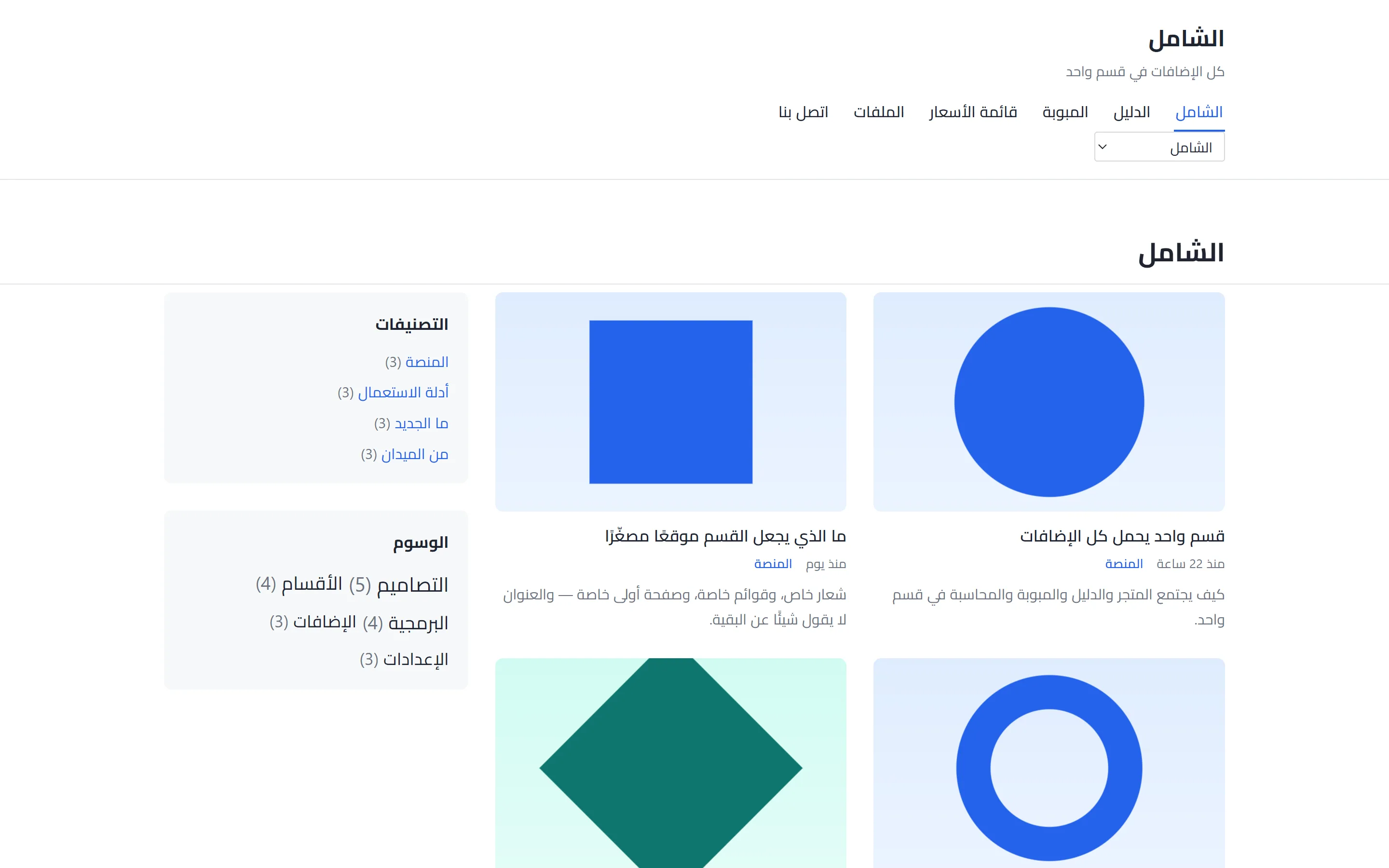
What it can draw
A design draws only the families it declares. One that does not name an addon simply has no components for it — a news template has no shop.
- Accounting
- Articles
- Assistant
- Authentication
- Basic
- Businesses
- Classifieds
- Commerce
- Courses
- Ecommerce
- Management
- MobileApp
- RealEstate
Its top and its bottom
7 headers to choose between:
- Standard
- Centred
- Contact strip
- Single line
- Masthead
- Centred, quiet bar
- No header
8 footers to choose between:
- Simple
- Three columns
- One line
- Dark band
- Copyright line
- Deep columns
- Two halves, then a strip
- No footer
The shapes it offers
Where a component can be drawn more than one way, these are the shapes this design offers and what each is for.
Articles.Categories
- A ruled heading, each count across a dotted line
Articles.Category
- The shelf's picture as a masthead, then cards
Articles.Detail
- Picture first, full width
- The cover first, the words on a card under it
- The cover first, then the shelf, the byline and the headline
- Words only, no cover picture It cannot use: showImage, showCategory, showReadCount — so the composer does not offer them here.
Articles.List
- A ruled heading over «more from this shelf» (3+) It cannot use: showSummary, pager — so the composer does not offer them here.
- A ruled heading, the words on the picture (1+)
- Cards four across, the whole card a link (4+) It cannot use: columns, pager — so the composer does not offer them here.
- Cards with the date on a tab Holds 3 — a floor, so a placement with fewer is raised to meet it.
- Cards — a picture on top of each Holds 3 — a floor, so a placement with fewer is raised to meet it.
- Equal cards in a strip — you choose how many across (2+) It cannot use: pager — so the composer does not offer them here.
- Front-page mosaic It cannot use: pager, showSummary, columns — so the composer does not offer them here.
- Headlines only It cannot use: columns, showSummary, showAuthor, showCategory, showCategories, showReadCount, showCommentCount — so the composer does not offer them here.
- More from the open article's category (any) It cannot use: categoryId, columns, pager — so the composer does not offer them here.
- News ticker It cannot use: pager, showSummary, columns, showDate, showCategory — so the composer does not offer them here.
- One large, headlines beside it (5+) It cannot use: columns, pager — so the composer does not offer them here.
- One with its picture, small ones beside it (4+) It cannot use: columns, pager — so the composer does not offer them here.
- Two down each side, three carried between them (7) Holds 7 — a floor, so a placement with fewer is raised to meet it. It cannot use: columns, pager — so the composer does not offer them here.
- «More from this shelf» on a panel in the accent (3+) It cannot use: showSummary, pager, columns — so the composer does not offer them here.
Articles.Slider
- Full-width stage
Articles.Tags
- A ruled heading, the tags as bordered chips
Assistant.Chat
- In the page
Basic.Banner
- Advertisement beside the logo It cannot use: count, showText — so the composer does not offer them here.
- Picture only, no words
- Side by side
Basic.Contact
- A card for each way, form on a card
- A ruled column of ways, the form on a panel
- Details beside the form
- Each part in a panel
Basic.Html
- A panel with a heading bar
- A reading column
- A ruled heading bar over the prose
- Card
Basic.PageTitle
- Centred on a band
- One line: the trail, ending in the page
- The name and the trail on one line, on a card
Basic.Slider
- A full stage, like motoor's
- Band — a headline and a button on a colour Holds 1 — a floor, so a placement with fewer is raised to meet it. It cannot use: interval, showText — so the composer does not offer them here.
- Boxes — a mark, a heading and a line Holds 3 — a floor, so a placement with fewer is raised to meet it. It cannot use: interval, showText — so the composer does not offer them here.
- Hero — one slide, full width, words on the picture Holds 1 — a floor, so a placement with fewer is raised to meet it. It cannot use: interval, showText — so the composer does not offer them here.
- Logos — a row of marks and no words Holds 8 — a floor, so a placement with fewer is raised to meet it. It cannot use: interval, showText — so the composer does not offer them here.
- Stage — words beside the picture, full width Holds 8 — a floor, so a placement with fewer is raised to meet it.
- Steps — numbered, with a rule between them Holds 3 — a floor, so a placement with fewer is raised to meet it. It cannot use: interval, showText — so the composer does not offer them here.
- The original slider
- Words beside the picture
- Words over the picture
Courses.List
- The original course list It cannot use: bare, heading — so the composer does not offer them here.
Management.Buy
- A third of the row, with two boxes beside it It cannot use: serverPlans — so the composer does not offer them here.
- The panel on its own, full width It cannot use: appTitle, appLede, appUrl, aboutTitle, aboutLede, aboutUrl, serverPlans — so the composer does not offer them here.
How a page can be divided
A layout is how one page is divided. Every one of them has a band above the page and an area under it, whatever happens in the middle.
One column
- Above the page — 12 of twelve wide
- Content — 12 of twelve wide
- Under the page — 12 of twelve wide
One wide column
- Above the page — 12 of twelve wide
- Content — 12 of twelve wide
- Under the page — 12 of twelve wide
A narrow column
- Above the page — 12 of twelve wide
- Content — 8 of twelve wide
- Under the page — 12 of twelve wide
Content, then sidebar
- Above the page — 12 of twelve wide
- Content — 8 of twelve wide
- Sidebar — 4 of twelve wide
- Under the page — 12 of twelve wide
Sidebar, then content
- Above the page — 12 of twelve wide
- Content — 8 of twelve wide
- Sidebar — 4 of twelve wide
- Under the page — 12 of twelve wide
Two equal columns
- Above the page — 12 of twelve wide
- Content — 6 of twelve wide
- The second column — 6 of twelve wide
- Under the page — 12 of twelve wide
Two equal columns, edge to edge
- Above the page — 12 of twelve wide
- Content — 6 of twelve wide
- The second column — 6 of twelve wide
- Under the page — 12 of twelve wide
Three columns
- Above the page — 12 of twelve wide
- Content — 6 of twelve wide
- Left column — 3 of twelve wide
- Right column — 3 of twelve wide
- Under the page — 12 of twelve wide
Article page
- Above the page — 12 of twelve wide
- Content — 8 of twelve wide
- Sidebar — 4 of twelve wide
- Under the page — 12 of twelve wide
The Linka design
Back to topThe shapes, the chrome and the layouts the Linka design declares.
What it can draw
A design draws only the families it declares. One that does not name an addon simply has no components for it — a news template has no shop.
- Articles
- Authentication
- Basic
- Classifieds
Its top and its bottom
4 headers to choose between:
- News
- Compact
- News, with a breaking line and a top bar
- No header
3 footers to choose between:
- Detailed
- Plain
- No footer
The shapes it offers
Where a component can be drawn more than one way, these are the shapes this design offers and what each is for.
Articles.Detail
- Picture first, then the heading
Articles.List
- Dark strip — thumbnails three across (any) It cannot use: columns, pager — so the composer does not offer them here.
- Equal cards, three across (any) It cannot use: columns, pager — so the composer does not offer them here.
- Half to one article, half to four (5) It cannot use: columns, pager — so the composer does not offer them here.
- More from the open article's category (any) It cannot use: categoryId, pager — so the composer does not offer them here.
- Recent news — four cards and a list beside them (9+) It cannot use: columns, pager — so the composer does not offer them here.
- Sidebar list — small picture, headline, date (any) It cannot use: columns, pager — so the composer does not offer them here.
- Top news — one large, four beside it (5) It cannot use: columns, pager — so the composer does not offer them here.
- Wide rows with a headline list beside them (10+) It cannot use: columns, pager — so the composer does not offer them here.
Basic.Slider
- The original slider
How a page can be divided
A layout is how one page is divided. Every one of them has a band above the page and an area under it, whatever happens in the middle.
One column
- Above the page — 12 of twelve wide
- Content — 12 of twelve wide
- Under the page — 12 of twelve wide
A narrow column
- Above the page — 12 of twelve wide
- Content — 8 of twelve wide
- Under the page — 12 of twelve wide
Content, then sidebar
- Above the page — 12 of twelve wide
- Content — 8 of twelve wide
- Sidebar — 4 of twelve wide
- Under the page — 12 of twelve wide
Sidebar, then content
- Above the page — 12 of twelve wide
- Content — 8 of twelve wide
- Sidebar — 4 of twelve wide
- Under the page — 12 of twelve wide
Two equal columns
- Above the page — 12 of twelve wide
- Content — 6 of twelve wide
- The second column — 6 of twelve wide
- Under the page — 12 of twelve wide
Three columns
- Above the page — 12 of twelve wide
- Content — 6 of twelve wide
- Left column — 3 of twelve wide
- Right column — 3 of twelve wide
- Under the page — 12 of twelve wide
Article page
- Above the page — 12 of twelve wide
- Content — 8 of twelve wide
- Sidebar — 4 of twelve wide
- Under the page — 12 of twelve wide
The Porto design
Back to topThe shapes, the chrome and the layouts the Porto design declares.
What it can draw
A design draws only the families it declares. One that does not name an addon simply has no components for it — a news template has no shop.
- Articles
- Assistant
- Authentication
- Basic
- Businesses
- Management
- MobileApp
Its top and its bottom
4 headers to choose between:
- Standard
- With a contact bar
- Deep band, menu on one row
- No header
4 footers to choose between:
- Detailed
- One line
- Coloured, with the address and the menu
- No footer
The shapes it offers
Where a component can be drawn more than one way, these are the shapes this design offers and what each is for.
Articles.List
- More from the open article's category (any) It cannot use: categoryId, pager — so the composer does not offer them here.
Assistant.Chat
- In the page
Basic.Html
- Card
Basic.Slider
- Band — a headline and a button on a colour Holds 1 — a floor, so a placement with fewer is raised to meet it. It cannot use: interval, showText — so the composer does not offer them here.
- Boxes — a mark, a heading and a line Holds 3 — a floor, so a placement with fewer is raised to meet it. It cannot use: interval, showText — so the composer does not offer them here.
- Hero — one slide, full width, words on the picture Holds 1 — a floor, so a placement with fewer is raised to meet it. It cannot use: interval, showText — so the composer does not offer them here.
- Steps — numbered, with a rule between them Holds 3 — a floor, so a placement with fewer is raised to meet it. It cannot use: interval, showText — so the composer does not offer them here.
- The original slider
Management.Buy
- A third of the row, with two boxes beside it
- The panel on its own, full width It cannot use: appTitle, appLede, appUrl, aboutTitle, aboutLede, aboutUrl — so the composer does not offer them here.
How a page can be divided
A layout is how one page is divided. Every one of them has a band above the page and an area under it, whatever happens in the middle.
One column
- Above the page — 12 of twelve wide
- Content — 12 of twelve wide
- Under the page — 12 of twelve wide
A narrow column
- Above the page — 12 of twelve wide
- Content — 8 of twelve wide
- Under the page — 12 of twelve wide
Content, then sidebar
- Above the page — 12 of twelve wide
- Content — 8 of twelve wide
- Sidebar — 4 of twelve wide
- Under the page — 12 of twelve wide
Sidebar, then content
- Above the page — 12 of twelve wide
- Content — 8 of twelve wide
- Sidebar — 4 of twelve wide
- Under the page — 12 of twelve wide
Two equal columns
- Above the page — 12 of twelve wide
- Content — 6 of twelve wide
- The second column — 6 of twelve wide
- Under the page — 12 of twelve wide
Two equal columns, edge to edge
- Above the page — 12 of twelve wide
- Content — 6 of twelve wide
- The second column — 6 of twelve wide
- Under the page — 12 of twelve wide
Three columns
- Above the page — 12 of twelve wide
- Content — 6 of twelve wide
- Left column — 3 of twelve wide
- Right column — 3 of twelve wide
- Under the page — 12 of twelve wide
Article page
- Above the page — 12 of twelve wide
- Content — 8 of twelve wide
- Sidebar — 4 of twelve wide
- Under the page — 12 of twelve wide
The Sinmun design
Back to topThe shapes, the chrome and the layouts the Sinmun design declares.
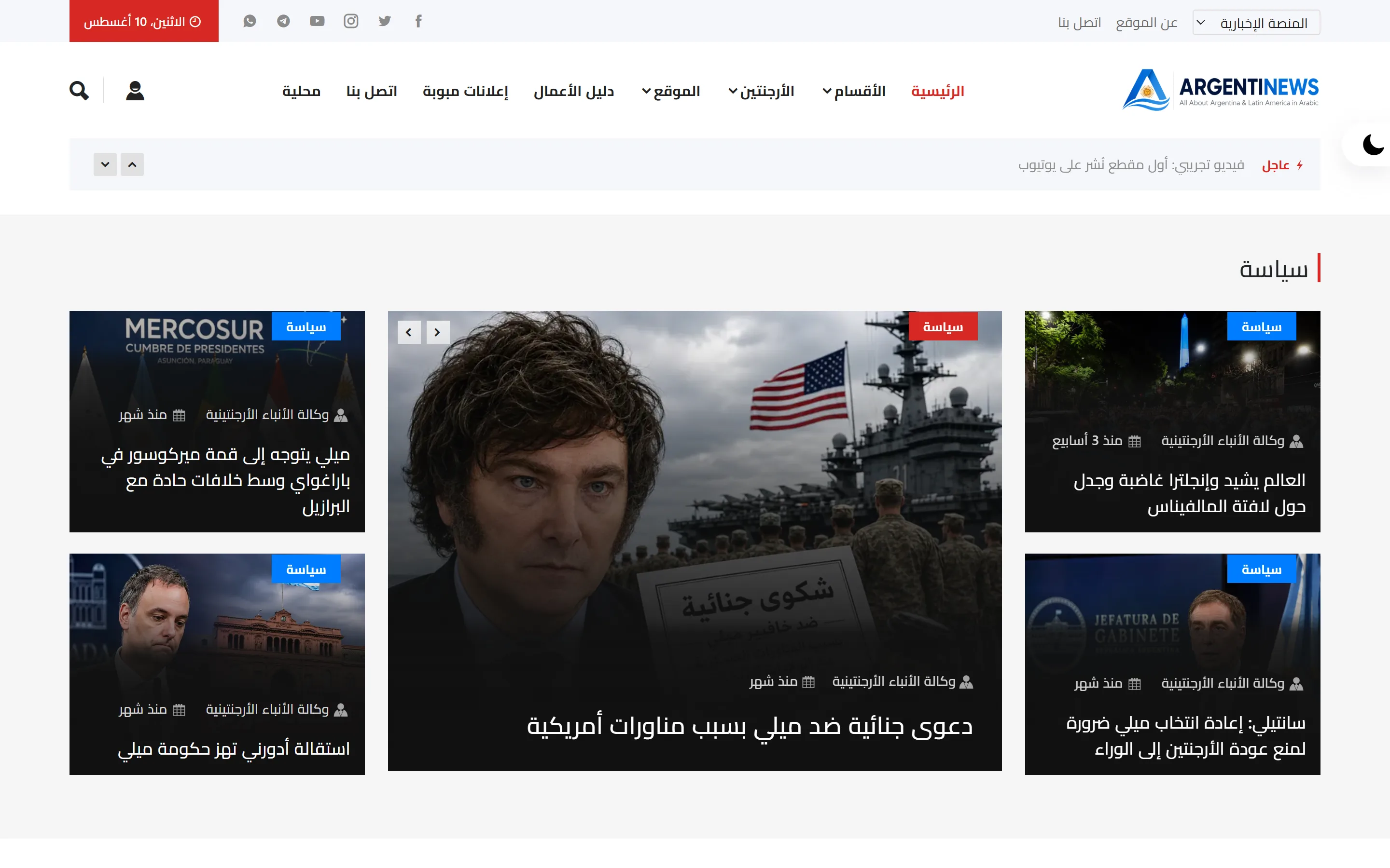
What it can draw
A design draws only the families it declares. One that does not name an addon simply has no components for it — a news template has no shop.
- Articles
- Authentication
- Basic
- Businesses
- Classifieds
Its top and its bottom
2 headers to choose between:
- News
- No header
2 footers to choose between:
- Detailed
- No footer
The shapes it offers
Where a component can be drawn more than one way, these are the shapes this design offers and what each is for.
Articles.Detail
- Heading first, then the picture
Articles.List
- Cards four across, the whole card a link (4+) It cannot use: columns, pager — so the composer does not offer them here.
- Columns of a card over three headlines — four to a column (any) It cannot use: columns, pager — so the composer does not offer them here.
- Equal cards in a strip — you choose how many across (2+) It cannot use: pager — so the composer does not offer them here.
- Four cards across (4+) It cannot use: columns, pager — so the composer does not offer them here.
- More from the open article's category (any) It cannot use: categoryId, pager — so the composer does not offer them here.
- One large, headlines beside it (5+) It cannot use: columns, pager — so the composer does not offer them here.
- One with its lead, the rest as headlines beside (any) It cannot use: columns, pager — so the composer does not offer them here.
- One with its picture, small ones beside it (4+) It cannot use: columns, pager — so the composer does not offer them here.
- Picture and words side by side, twice, with a list beside (5+) Holds 2 — a floor, so a placement with fewer is raised to meet it. It cannot use: columns, pager — so the composer does not offer them here.
- Two columns: four categories, a newsletter and an advertisement (15+) Holds 15 — a floor, so a placement with fewer is raised to meet it. It cannot use: columns, pager — so the composer does not offer them here.
- Two down each side, three carried between them (7) Holds 7 — a floor, so a placement with fewer is raised to meet it. It cannot use: columns, pager — so the composer does not offer them here.
Basic.Slider
- The original slider
Businesses.Categories
- What the directory is made of — tiles
Businesses.Category
- One category: what is under it, and what is in it
Businesses.Detail
- One place: its details, its branches
Businesses.List
- The directory's places, as cards
Businesses.Map
- The places on a map
Classifieds.Categories
- What is advertised here — tiles
Classifieds.Category
- One category: what is under it, and what is in it
Classifieds.Detail
- One advertisement: its pictures, its details, its seller
Classifieds.List
- The advertisements, as cards
How a page can be divided
A layout is how one page is divided. Every one of them has a band above the page and an area under it, whatever happens in the middle.
One column
- Above the page — 12 of twelve wide
- Content — 12 of twelve wide
- Under the page — 12 of twelve wide
A narrow column
- Above the page — 12 of twelve wide
- Content — 8 of twelve wide
- Under the page — 12 of twelve wide
Content, then sidebar
- Above the page — 12 of twelve wide
- Content — 8 of twelve wide
- Sidebar — 4 of twelve wide
- Under the page — 12 of twelve wide
Sidebar, then content
- Above the page — 12 of twelve wide
- Content — 8 of twelve wide
- Sidebar — 4 of twelve wide
- Under the page — 12 of twelve wide
Two equal columns
- Above the page — 12 of twelve wide
- Content — 6 of twelve wide
- The second column — 6 of twelve wide
- Under the page — 12 of twelve wide
Three columns
- Above the page — 12 of twelve wide
- Content — 6 of twelve wide
- Left column — 3 of twelve wide
- Right column — 3 of twelve wide
- Under the page — 12 of twelve wide
Article page
- Above the page — 12 of twelve wide
- Content — 8 of twelve wide
- Sidebar — 4 of twelve wide
- Under the page — 12 of twelve wide
The University of Education design
Back to topThe shapes, the chrome and the layouts the University of Education design declares.
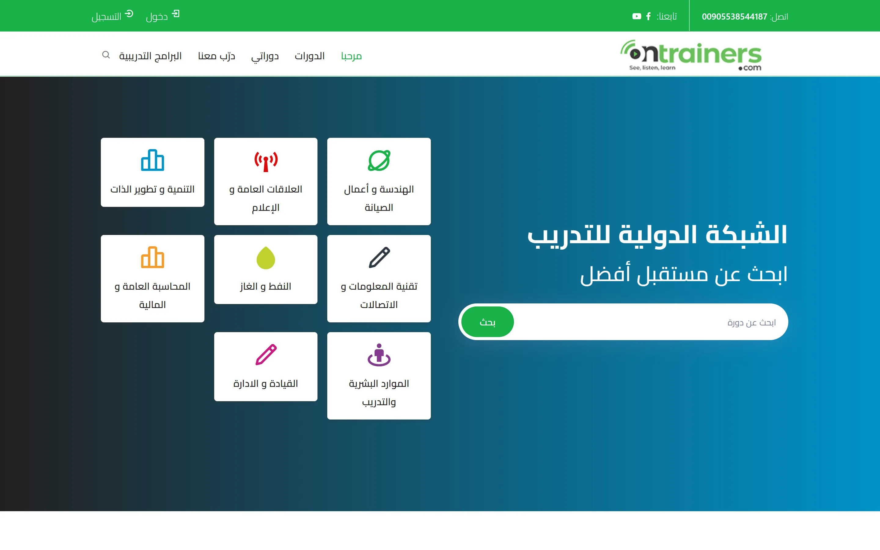
What it can draw
A design draws only the families it declares. One that does not name an addon simply has no components for it — a news template has no shop.
- Assistant
- Authentication
- Basic
- Commerce
- Courses
Its top and its bottom
2 headers to choose between:
- Bar over the menu
- No header
2 footers to choose between:
- Mark, menu and contacts
- No footer
The shapes it offers
Where a component can be drawn more than one way, these are the shapes this design offers and what each is for.
Assistant.Chat
- In the page
Basic.Slider
- The original slider
How a page can be divided
A layout is how one page is divided. Every one of them has a band above the page and an area under it, whatever happens in the middle.
One column
- Above the page — 12 of twelve wide
- Content — 12 of twelve wide
- Under the page — 12 of twelve wide
Content with a column beside it
- Above the page — 12 of twelve wide
- Content — 8 of twelve wide
- Beside it — 4 of twelve wide
- Under the page — 12 of twelve wide
A column, then the content
- Above the page — 12 of twelve wide
- Content — 8 of twelve wide
- Beside it — 4 of twelve wide
- Under the page — 12 of twelve wide
A narrow column
- Above the page — 12 of twelve wide
- Content — 8 of twelve wide
- Under the page — 12 of twelve wide
Two equal columns
- Above the page — 12 of twelve wide
- Content — 6 of twelve wide
- The second column — 6 of twelve wide
- Under the page — 12 of twelve wide
Three columns
- Above the page — 12 of twelve wide
- Content — 6 of twelve wide
- Left column — 3 of twelve wide
- Right column — 3 of twelve wide
- Under the page — 12 of twelve wide
What's new
Back to topEvery release, newest first, in the words of whoever asked for it.
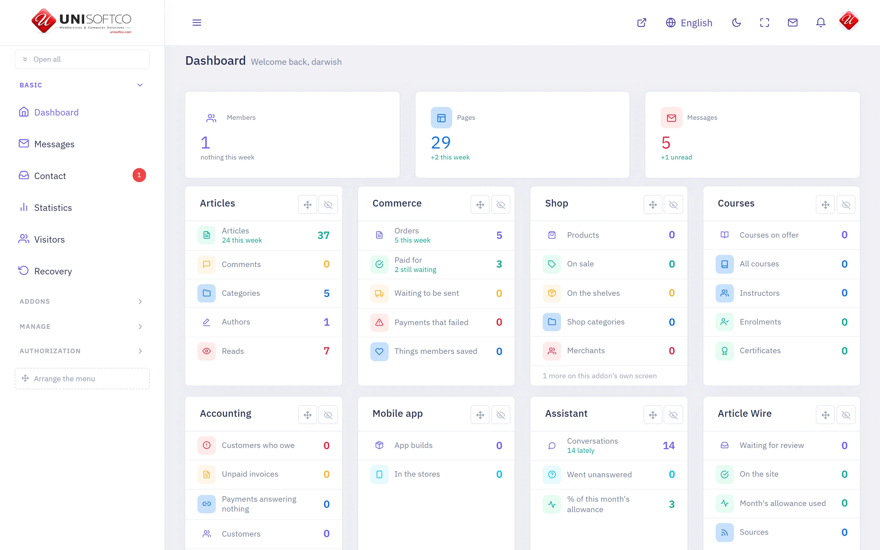
How to read this
Every release says what you can now do, in the words of whoever asked for it. Where an entry is marked, it touched your data: Added means something new is stored, Changed means something already stored is read differently, and most entries are neither.
Blocks that should sit several across, lists that were blank, and only the open boxes offered
0.235.0 — 16 September 2026
A block set to show three or four across was drawing ONE PER ROW on every screen wide enough to know better — a single rule in the shared stylesheet was pinning every column to the full width, whatever the block was set to. It affects the lists that are arranged in a grid: places in the directory, classified ads, the shop, properties, and articles. Nothing needs re-saving; the pages simply draw the way their settings always said. In the page builder, the CATEGORY list of four of those blocks came up empty — the directory's and the classifieds' drew blank rows, and the shop's and the properties' looked right and stored nothing, so a block narrowed to one category went on showing everything. Both are fixed, and a category under another is indented in the list. A design you cannot wear yet — one still in the Market, or one of your own still a draft — now says so in brackets and stands dimmed in the chooser, instead of looking like every design you can. In the cash book, the box chooser on a new movement, the filter above the movements and the one on the graphs offer only boxes that are still open; correcting an old movement written on a box since closed still finds it, marked. And a company's branches in the Business Directory open UNDER its row, like everything else that belongs to a row, instead of taking the whole window and losing your place in the list.
You arrange the application's header and footer element by element now
0.232.0 — 15 September 2026
The left of the builder carries a LIBRARY — the logo, the name, the slogan, the search, signing in, the strip of sections, the strip of pages, the way home and the basket — and you drag one onto the header or the footer in the middle, or press it to add it at the foot. Each half is its own area there and takes only what belongs in it: a basket dragged at the header is simply not taken. EVERY ELEMENT HAS ITS OWN PROPERTIES: which row it stands in, where in that row (the reading edge, the middle, the far edge — sides and not left and right, so it turns itself in Arabic), and then its own — the mark's height belongs to the logo, the door to signing in, and the chevrons to the two strips. NOTHING CHANGES ON ANY PHONE UNTIL YOU ARRANGE ONE: a half you have not touched draws exactly what it always drew, and the area says so. The middle also moved: the properties sit beside the rows you are arranging and the phone is the last column, which is what you asked for. Every element in the library is something the application already draws — a chip you could drop that the phone then could not draw would be a control that changes nothing.
The application builder shows the design and the phone side by side
0.231.0 — 14 September 2026
The two buttons at the top are gone and the middle is split instead: the page's blocks on one side, the phone drawing them on the other, both at once. They answer different questions about one page — what is on it, and what it looks like — and a toggle made you hold one in your head while looking at the other. On a narrow window the phone drops underneath rather than being squeezed, because it is a MEASUREMENT: what wraps there wraps on a real phone. AND THAT MEASUREMENT WAS TWENTY PIXELS OUT, on this screen and on Preview, since the frame was first drawn — the width was set on the frame and its own padding ate it, so an iPhone 15 was being drawn 373 wide where the phone reports 393. A headline that fits a real phone and not that frame was being shown to you as one that does not fit. The width is on the screen itself now, measured in a browser at four window sizes. AND THE HEADER’S TWO STRIPS HAVE THEIR OWN SWITCHES NOW — the sections, and that section’s pages. Both are drawn unless you switch them off, so nothing on any phone changes until you do. One word of care, and it is said under the switch too: on a site with several sections that strip is often the only road from one to another, so with it off the way across is a tab pointed at that section, or nothing.
The application's header now has its own colour, its words and the height of its mark
0.230.0 — 14 September 2026
You asked why the header's properties showed no colours and no height, and the answer was that it had none: the bar took whatever ground the page had, its words took whatever your reader's phone uses, and the mark was a fixed 34 built into the application. Four things are yours now — THE HEADER'S GROUND and ITS WORDS, HOW TALL THE MARK IS, and THE GROUND OF THE BOTTOM BAR — and they travel like every colour here, so they reach a phone that already has the application with no new build. EVERY ONE OF THEM STARTS AS «AS IT WAS», so nothing on any phone changes until you choose, and each has a button that puts it back. Two things said plainly rather than promised: the bottom bar is the phone's own bar, so its height and its chosen tab are the phone's and only its ground is yours; and a dark header needs its words chosen too, which is the one thing worth looking at on a real phone. AND A CORRECTION WITH IT: the preview had been filling the header with your main colour and writing white on it, and the application never painted it at all — so the screen was showing you a header your own phone did not have. Both sides now draw the same four values.
The application's header and its bottom bar are arranged in the builder too
0.229.0 — 14 September 2026
The left of the builder now opens with THE HEADER and ends with THE FOOTER, and pressing either one shows what it is made of: the header carries whether a reader may sign in from inside the application and how a strip offers what does not fit, and the footer carries the tabs — which of them, in what order, and which page each opens. THE MIDDLE DRAWS BOTH, above and below the page you are looking at, so a tab you point at a page appears in the bar beside you. What the bar shows is what a PHONE is sent and not the list you ticked: a tab with no page, or whose page is not published, is left out here exactly as it is left out there. The tabs are the same editor the application's own settings screen has always carried — one editor and not a second copy of it — and the frame is drawn by the same code as the Preview screen, so the two can never show you two different applications. AND THE WALK READS AS ONE THING NOW: the sections sit indented under the header and that section’s pages one step deeper again, because those two strips are what the header draws — they still do exactly what they did, which is choose the page you are arranging. AND EACH OF THEM HAS ITS OWN PROPERTIES NOW: press a section or a page and you get where it comes in the strip the header draws — arrows, and only in the application, your site’s own order does not move — and whether the application carries it at all, with the way back named under the switch. A page also says where it answers and how many of its blocks the application can draw. A section’s name, mark and slogan are NOT changed from here on purpose: six places on your site read that name, so it stays where it is edited.
Fixed: the application builder opened on a white page
0.228.0 — 14 September 2026
Pressing «What it will show» opened a blank screen with no sidebar, and it was ours from an hour earlier: the properties panel's two new pieces of state were written BELOW the screen's own «still loading» line. A React screen must do the same work on every draw, and this one did less while it waited and more once the data arrived — which React answers by taking the whole panel down, not just that screen. NOTHING WE HAD COULD SEE IT: both typecheckers passed, the build passed and all fourteen checks passed, because it only happens on the second draw with real data. So there is a fifteenth check now, and it found a SECOND one nobody had met: on the University design, a course page whose course is gone — an archived one reached by an old link — would have gone blank instead of saying «this course is gone». Both are fixed.
Every block on your pages is now drawn by the phone application
0.227.0 — 13 September 2026
The last fifteen, and the count is what matters: of the 75 components actually placed on pages you have switched on for the application, NONE is left without a drawing. Sixteen were drawn four days ago; seventy-six are now. This batch: a customer's own statement and one invoice of his, your price list, the addons and designs and languages this server carries, the BASKET with its lines and its total, what a reader saved, and registration and «I forgot my password» as real forms. FIVE ARE PANELS WITH A DOOR, each for a stated reason: the checkout (the card fields are drawn by your gateway and the agreement is captured by revision), the support form and putting a property on (both upload files), and setting a new password (its token lives in the link you opened in your browser, never in the application). AND «GET OUR APPLICATION» NOW DRAWS NOTHING INSIDE THE APPLICATION, which is the right answer rather than a gap: a reader meeting it there has already installed it. Nothing about your pages changed — every one of these draws what the page already sends.
The board and the business directory are drawn by the application
0.226.0 — 13 September 2026
Nine more. THE BOARD: the advertisements, a shelf's own page, the shelves with their counts, and an advertisement's own page — every photograph, where it is, and a telephone number that DIALS. A number you hid stays hidden, because the site never sends it in the first place. THE DIRECTORY: a trade's page, the trades, a business with its branches, and the map. EACH BRANCH SHOWS ITS OWN WEEK, and the three states are kept apart as they are on your site: open, closed, and NOBODY HAS SAID — a day nobody filled in is never reported as shut. Two periods a day are drawn, so a shop that closes at noon reads correctly. Addresses open the reader's own map application rather than a map inside the application, which is what every other place on this phone already does. POSTING AN ADVERTISEMENT opens the page on your website: that form uploads photographs — the camera, a permission for each and a failure to report per file — and it also answers whether the poster may post at all. Nothing about your pages changed.
The shop and the courses are drawn by the phone application
0.225.0 — 13 September 2026
Seventeen more components the application had no drawing for. THE SHOP: its shelves with their counts, a shelf's own page, a merchant's page with his score, the narrowed list with what it was narrowed by, a product's own page with every picture and its facts, and the reviews — readable by everybody and writable by whoever your site lets write. A merchant also gets his own four tables on a phone: what he sells, what sold, what he is owed and what has been sent him, PER CURRENCY and never joined into one figure. THE COURSES: the catalogue, a subject's page, a course's own page, the classroom programmes with their six sections each, a certificate — and the box a stranger checks a number in — what a student has taken, and the curriculum of a course he is enrolled in. TWO THINGS ARE DELIBERATE DOORWAYS and the reasons are written where they are made: a LESSON'S VIDEO opens in the player that is licensed to show it (Vimeo or YouTube, which is where your lessons live), and ASKING to sell or to teach opens the page on your website, where the refusal reasons and «where I stand» already live. Nothing about your pages changed.
Your own designs appear on the section that would wear them
0.224.0 — 13 September 2026 (Changed)
A design you assemble is created switched OFF, so nothing half-built can dress a live section — and the consequence was that a design you HAD drawn was in no picker either, with nothing saying why. Two changes. PUTTING A HEADER OR A FOOTER INTO USE now finishes the design: it stops being a draft in the same act, because from that press on it draws a band of your own, which is the whole of what the switch was waiting for. And a design of yours that is still a draft is now LISTED on the section's Template picker with «your own design — still a draft» beside it: choosing it says so and names the screen that switches it on, rather than leaving you looking for a design that seems to have vanished. The pill on Templates → My designs still switches either way, and one you switch OFF by hand stays off.
Thirteen more of your blocks are drawn by the phone application
0.223.0 — 13 September 2026
The application draws each block itself — there is no browser inside it — so a component nobody has written a drawing for is simply absent from the phone, which is what the «the application does not draw this part yet» mark on the new application page means. Sixteen were drawn; twenty-nine are now. New: the ASSISTANT, as a panel in the page with the conversation kept and your opening hours said in the reader's own language; the DOMAIN SEARCH, asked live; the PAYMENT MARKS, showing what you actually switched on; a category page, an author page, a followed story, the COMMENTS (readable by everybody and writable by whoever your site lets write), the news MAP as a list that opens the reader's own map application, the HANDBOOK's chapters, a member's card, your FILES, and the cancellation button. THE BUYING PANEL IS THE ONE DELIBERATE EXCEPTION: it draws your heading and your words and opens the page on your website for the till itself, because the card fields there are drawn by the payment gateway and the agreement is captured by revision — neither belongs in a second copy inside an application. Nothing about your pages changed: these draw what the page already sends.
A block's own properties open in the application builder
0.222.0 — 13 September 2026
Pressing a block on the new application page showed one switch — whether the phone draws it — and nothing else, which read as a panel that had failed to load. Two changes. The switch is GONE from there: this page draws only what is already switched on, so a switch inside it could only ever make the thing in front of you vanish, and its own place is the composer, on the block's own row, where it has always been. In its place are the block's REAL settings — the same fields the composer's gear opens, drawn by the same editor, with a Save beneath them. THE VALUE IS THE SITE'S TOO and the panel says so above the fields: one placement, one set of settings, so changing one here changes your page as well as your phone. A component that declares nothing to set says that rather than drawing an empty panel, and a component the application has no drawing for yet is marked, because a field filled in for one of those reaches the page and never the phone. The «What it will show» button also left this page's bar: a page whose whole rule is «only what is switched on appears» had a button on it that opened every switch. Nothing was lost with it — that switch is on the section's form, on the page's form and on each block's row, and the older three-column panel is still where it was.
A design you delete now leaves the shared store too
0.221.0 — 13 September 2026 (Changed)
Saving a design to the store wrote three files into one folder every site on this server shares, and nothing anywhere could take them out again: the switch on its toolbar only stopped it being SHOWN. So a design you deleted from your own panel went on standing in that folder, on the shelf, under a name no screen of yours could reach. Two things close it. Deleting a design now removes its copy from the store in the same act — and every card on the shelf that is YOURS carries a delete button of its own, which is the only way to reach an entry whose design went long ago. WHAT ANOTHER SITE HAS ALREADY TAKEN FROM IT STAYS ON THAT SITE'S OWN DESIGN: this removes a file, it does not recall a copy. A design somebody is still wearing is refused first, exactly as before, and nothing is taken off the store for it. And if the folder itself will not let go of a file, the design is still deleted and your activity log says the copy was left — so a store on a read-only disk can never make a design undeletable.
The application is built on a page of its own now
0.220.0 — 13 September 2026
«What it will show» opened three columns of switches under the row — it could answer what the reader SEES and never what it LOOKS like, because a panel four columns wide has nowhere to draw a phone. It is a full page now, the same shape as the Template Designer: the walk on one side (a section, then its pages), the page itself in the middle with Design and Preview as two toggle buttons and the real phone widths beside them, and the properties of whatever you press on the other side — the block's own, or the application's colours when nothing is selected. ONLY WHAT IS SET TO SHOW IN THE APPLICATION APPEARS THERE, because what the phone will never draw is not a thing to lay out; the switches are still on each row's own form and behind one button in the page's bar. Nothing about what is stored changed, and the older panels are still where they were until each has been measured against its replacement.
Thirty-nine more colours on the plain design obey your palette
0.219.0 — 13 September 2026
The plain design's stylesheet wrote each colour as a variable with a fixed one behind it, and fourteen of the names it used that way were declared nowhere — 157 places where only the fixed colour was ever drawn, so the palette on your design could not reach them. Thirty-nine of those now read the real ones: eight card backgrounds follow «Background» and thirty-one quiet-text colours follow «Quiet text». ON A SITE THAT HAS SET NO COLOUR NOTHING MOVES — only the identical ones were changed, measured declaration by declaration. Where you HAVE set a quiet-text colour those thirty-one now show it, which is the point; check it reads well against white, because a pale grey that was unreachable before is judgeable now. The rest are deliberately left: they fall back to eight different greys and unifying them would redecorate rather than repair.
The stars and the heart are shapes again on the plain design
0.218.0 — 13 September 2026
A product rating's stars and a favourite's heart are drawn as masks, and the three pictures they are masked with were declared in the CANVAS design and used, unchanged, in the plain one — where nothing declared them. A mask that resolves to nothing does not warn, does not fall back and does not fail to load: it paints the box. So a shop or a property list on the plain design drew solid squares where its stars should be. The same fault was found and fixed for the basket glyph in August, and the note left above it then is what made these three findable. Nothing new is fetched: the pictures travel inside the stylesheet.
The way out of the composer is at the end of its bar
0.217.0 — 13 September 2026
«Done» stood first on the composer's toolbar — which is where the browser's own back button is, and therefore the last place anything of ours belongs: you come to that bar for the section, the page and the arrangement, and the first thing you met was the door out. It is now at the far end, which is also where the header and footer builders keep theirs, so the three screens agree. On an Arabic panel the row turns itself, so it is the far right for a reader of English and the far left for a reader of Arabic — and its arrow turns with it.
The contact form looks like a form on the plain design
0.216.0 — 13 September 2026
Every other design dresses this form in its own theme's controls; the plain one — ours, the one a design you assemble is usually based on — shipped no form styling at all, so it drew the raw browser widgets: five labels and five boxes run together on one line, and a grey Send. It now has labels over full-width fields, a focus ring in YOUR accent colour, the captcha picture, its refresh button and its box on one line, and a Send button in your accent. Nothing about what the form does or asks changed.
One link of a menu can be a mega menu
0.215.0 — 13 September 2026
A mega menu was a whole ELEMENT, so every top-level link in it opened a panel — and a real masthead mixes them: one link opens a panel and the one beside it is an ordinary dropdown. That could not be built at all. The menu element now carries it: switch it on, say WHICH link by its number («3», or «2, 5» for two of them, counting the links you can see), and choose the kind of panel — its children dealt across columns each with its own heading, or the link itself as the heading with its children in one list beneath it and a picture beside them. Every other link in that menu keeps its ordinary dropdown. Nothing changes on a menu you have already drawn, and the separate Mega menu element stays for a menu whose every link should open a panel.
An element's delete button is reachable
0.214.0 — 13 September 2026
The copy and delete tools appeared only when the pointer was over an element, so the chip GREW at the moment you reached for them — and in a narrow column the extra spilled past its edge, where the next element's own chip painted over exactly the button you were aiming at. The tools now keep their room whether or not they are showing, so nothing grows and nothing is covered, and the element under the pointer comes forward besides.
A block you made invisible can be found again
0.213.0 — 13 September 2026
A component whose style you set to nought opacity drew as an empty frame on the very screen that sets it — and an invisible box cannot be pressed, so the field that emptied it could never be reached again. In the design frame such a block is now drawn faintly rather than not at all, exactly as the header builder's own canvas has always done. Your pages are untouched: on a real page «transparent» still means transparent, because hiding a block is a thing a design is allowed to say. The panel still shows the real figure, so you can see it is nought and change it.
The design frame can no longer act on your account
0.212.0 — 13 September 2026
The frame drew the page as a SIGNED-IN visitor, because that is right for the composer — and on the sign-in component it meant «you are signed in as …» with a working sign-out button in it. Pressing it signed the owner out of his own panel. A design frame is a VISITOR now: the sign-in and the sign-in-and-register components draw their FORMS, which is what a visitor meets and what there is to lay out — and with no viewer in the frame there is nothing for a control in it to act as. The button is not disabled; it does not exist. The composer's own previews are unchanged. The frame also names the component it is drawing, over the picture, and its note no longer claims data is invented where it is not.
A component being designed has something to draw
0.211.0 — 13 September 2026
The frame beside the component sheet draws your real site, which is the point of it — and a real site has nothing at all for several components: no advertisement slots, no files, no banner or slider set chosen, no signed-in member. So the one screen for designing a component showed a white rectangle for six of them. Where a component would draw NOTHING it is now given an example to lay out against, and the bar says so in words: some of what you see there is ours, put in for designing, and none of it is saved or ever seen by a visitor. Where your site HAS content the frame still draws yours — your own articles, your own banners — because you are colouring the thing you will look at. Nothing reaches a page: every other preview, the composer's included, shows real placements exactly as before.
Reset puts a header back, it no longer empties it
0.210.0 — 13 September 2026
It handed back an EMPTY header, which is the same thing as «how it was» for a design you just started and the opposite of it for one you have been drawing for a week: one press and the week was gone. It now puts the header or footer back to exactly what was on the screen when you opened it — and it goes on the undo stack like anything else, so pressing it by mistake is one press from being undone. Choosing another header from the shelf, and throwing a draft away, each become the new starting point; importing a file or taking a design off the store do NOT, so Reset undoes those rather than agreeing with them. WHAT IT NO LONGER DOES: empty a band completely. That is still one press per band in the band's own properties panel.
The components panel is four tabs now
0.209.0 — 13 September 2026
It was one column: which design draws a component, then its numbers and switches, then ten groups of style fields — and the last of them was five screens below the first. It is now General, Style, Layout and Advanced, the same four the header and footer builders use, so there is one panel to learn rather than two. NOT ONE FIELD WAS ADDED OR REMOVED, only where each stands. The Normal/Hover pair left the toolbar for the panel, where it belongs — it is not a screen width — and brought Active with it, which the header panel has always offered. And every style tab now SAYS which width it is writing: it always followed the desktop/tablet/mobile buttons and never told you, so you could not know you may set a different colour or size per screen. The numbers on General are the design's answer at every width, and the tab says so: a page is drawn once on the server for every screen, so how many records a list shows cannot differ by device — only what a stylesheet can say can.
The colours panel stops repeating the footer
0.208.0 — 13 September 2026
A design's colours panel carried the whole footer as well: «The footer itself» three times, «Bottom bar, first row» three times, and the footer's own width, mark, line, search, sign-in, currency, sections and date. Every one of those is something the footer builder now sets per band, with the page beside it — and two screens for one value means the second one saved looks like the first one failing. The header had been taken out of that panel already; the footer never was. What is left is the eleven no band can answer for: the site's palette, its spacing and its typeface, which every component reads.
The footer stops offering what belongs at the top of a page
0.207.0 — 13 September 2026
One list of elements served both ends, so the footer offered a mega menu whose panel opens past the end of the document, a search box nobody scrolls down to use, a live «are we open now» indicator, the weather and a breaking-news line. Those five are the masthead's now. Nothing you have already placed is removed or stopped — it goes on being drawn and its panel goes on answering; what changed is what the library offers. And three things that DO belong at the foot were turned rather than removed: a footer menu's submenu, the currency list and the section list now open upward, where before they opened off the bottom of the page.
A list can end in one «Show more» button
0.206.0 — 13 September 2026 (Added)
A fifth answer to «Pages» on every article list, every category page and both business lists: one button under the list instead of a row of numbers. It is a real link to the next page wearing a button's dress, so a reader with no JavaScript still gets there and a search engine can still walk a long archive — and it disappears on the last page rather than sitting there dead. It has no «above the list» twin: a «show more» over a list nobody has read yet points at nothing. Nothing changes on a list you have already placed until you choose it.
The components sheet shows what you set on it
0.205.0 — 13 September 2026
Setting how many records a component shows — or how many across, or where its pager goes — changed nothing in the page beside the fields. Nor did a numbered SHAPE's own style: the frame was asking for the plain component and could not be told about the shape at all, so the one screen that sets those things was the one screen that could not show them. It now draws the shape by its own name, wearing this design's numbers, and it is remade the moment a number is saved. Nothing about what a design stores changed.
The header itself can be selected, not only its four bands
0.204.0 — 13 September 2026
Every band in the header and the footer carried its name as a button on the arrangement, so pressing it opened that band's properties. The whole band — the header itself, which is what carries the background behind all four rows — had one way in and it was a row at the top of the Tree tab. Now it has its own tab in the corner of the canvas beside the four, and its properties are the panel you already know: its background, its own width, how the rows stack. Nothing about what a design stores changed, and no design moves: a header whose background was already set was already drawing it — what was missing was the way to change it.
A design says how many records a component shows
0.203.0 — 13 September 2026 (Added)
How many records, how many across, where the pager goes — a component's own knobs — could be set on a page's block and nowhere else, which meant setting them again on every page you ever build. A design answers them now, on the Components screen beside the design and the style: choose the component (or one of its shapes) and its own fields are there, the ones the component itself declares. IT IS A DEFAULT AND NEVER A DECISION: a block on a page keeps whatever it was given there, and this answers the blocks that said nothing — so nothing you have already arranged moves. Leave a field empty to let the component answer as it always did. A shape's answer beats its component's, and a page's own beats both. Two things are deliberately not offered here: anything chosen from your own rows — a category, a banner set — because a design's default naming one row of one section would be wrong on every other section.
The type is chosen from a list, and the frame draws your own records
0.202.0 — 12 September 2026
THE FONT AND ITS SIZE ARE LISTS NOW, wherever a block's own box is set — the header builder, the footer builder and the Components screen. A font stack is not something to type: a family naming a face nobody loads does not fail, it falls back in silence — so what is offered is what this site really loads, with the sizes anybody picks beside it. A value you had already typed is still there and still chosen; leaving it unset keeps the template's own type. AND A COMPONENT IS NOW DRAWN ON THE PAGE THAT REALLY CARRIES IT: previewing «Article list» showed an empty white box, because it was drawn in your DEFAULT section and your articles are in another one. The frame follows a real placement of that component, so what you style is your own records with your own pictures. The composer's preview is untouched — it names the page it is composing.
The component alone in the frame, and the frame follows what you set
0.201.0 — 12 September 2026
Previewing ONE component drew the whole page round it — the masthead, the menu, the footer — so the block whose colour you were setting was a tenth of what you were looking at. A preview that names a component now shows that component and nothing else, on the Components screen and in the gallery of component designs. AND THE FRAME NOW FOLLOWS THE STYLE: it was remade when you changed the component, its design or the width, and NEVER when you changed a colour, a spacing or the opacity — so the one thing that screen exists to set was the one thing it could not show you. If a component of yours seems to have vanished from the frame, look at «Opacity» under Visibility: at 0% the block is drawn invisible, and dragging it back to the end clears it.
Give a shape a name — double-click it
0.200.0 — 12 September 2026 (Added)
A component's shapes were called 01, 02, 03, and a number is something you have to remember the meaning of. Double-click one and type what it is: «The sidebar advert», «Headlines, no pictures». Return saves it, Escape puts it back, and emptying the field gives it its number again. THE NAME FOLLOWS IT TO THE PAGE COMPOSER, which is where it earns its keep: when a block chooses how it is drawn, the list reads your own words instead of «Basic.Ads01». The shape itself does not move — it is still 01 underneath, so every page already drawing it goes on drawing it, and a shape you have not named is still called by its number.
Adding a shape works now — it never did — and the frame is no longer empty
0.199.0 — 12 September 2026
ADDING A SHAPE NEVER WORKED, AND IT FAILED TWO DIFFERENT WAYS. Where the component already had one of the base's designs chosen it REFUSED with «this design draws it no such way»: a shape is stored under its own name, 01, and the save was asking whether the base declares that design for a component called «…01», which nothing does. And where the component had none — which is every component the base offers no choice for, all five of Authentication's among them — it was DROPPED in silence: the button reported success and no shape appeared. Both are fixed: a shape is measured against the component it is a shape OF, and a shape with no design of its own exists by its name and draws as the component does. A design the base never declared is still refused. AND THE FRAME WAS EMPTY for every component whose page is an address — an article, an author, a category, a story: the preview looked for something to show in your DEFAULT section, and on a site whose articles live in another section there was nothing there to find. It now looks in a section that has something, and moves the page with it. The composer's own preview is untouched: it names the page it is composing, so it still shows exactly that page.
The components are chosen by addon now, one rectangle each
0.198.0 — 12 September 2026
The Components screen listed its components in one flat list, each with its copies indented under it — AND IT WAS SHOWING FAR FEWER THAN YOU HAVE: the list was built from the components your base template offers a second DESIGN for, which is two of the newsroom's twelve. It is the same list the Addons screen shows now, so the two cannot disagree again: every component an addon you own contributes is there, and a component the base offers no second design for still has its own box and its own numbered copies. Its column is wider now and starts with the ADDON: choose one and its elements are what you see below — a rectangle per element, carrying its name, and under each a row of the small ones that are its shapes, 01, 02, 03, with «Add a new shape» as the last of them. Nothing about what a shape IS has changed: it is the same numbered copy with its own design and its own style, and a page picks it the same way. Two smaller things came with it: an element now shows the name its addon gives it over the name a page stores, and removing a shape asks first — a cross on something that small is pressed by accident in a way a trash button at the end of a row is not.
A design keeps several headers now, and you choose which one the site draws
0.197.0 — 12 September 2026
The header builder used to hold ONE header, so trying a second shape meant painting over the only copy of the first. The strip under the toolbar now shows the design's name, a list of the headers it keeps, a box for a name and a button that adds another — and choosing one from the list opens it, with everything you drew in it exactly where you left it. Up to twelve of them, per design, at each end of the page. WHAT THE SITE DRAWS IS STILL ONE OF THEM: «Use this header» is now also the switch that says which, and the list marks it. Two things are refused rather than done quietly — the one the site is drawing cannot be removed until another is in use, and «Throw the draft away» works only on that one, because on any other it would put a header there that it never held. Nothing changes for a design you have already drawn: it opens as the one header it has, under «The first one», and the site goes on drawing what it drew.
The graphs read at a glance: which way, and the figure over each column
0.234.0 — 12 September 2026
The amount is written above its own bar now instead of waiting for you to hover over it, and it rides up and down with the column. Written in full — a rounded figure over a bar is a number somebody reads as the number — so where they will not fit lying down they stand up and are read from the bar upward, and where there are more than forty of them they stay on the hover as before. A new filter beside the cash account asks WHICH WAY: only money in, only money out, or both as before. Choosing one draws that series alone rather than a row of noughts beside it, and shows only the ranking that can still answer — asked about payments alone, «من أين جاء المال» has nothing to be about. And as with the account filter, the running line then says «صافي الحركة التراكمي» rather than «الرصيد»: over receipts alone it is a total that only climbs, not a balance. The filters on both screens now sit on one line.
A design you have just made is offered to your sections
0.196.0 — 12 September 2026
A design created and not yet worn by anything was missing from every section's template list and from the gallery — so the only designs you could choose were the ones you had already chosen, and a new one could never be used at all. What a site assembled for itself is now its own, whether or not a section wears it yet; a template nobody granted the site is still refused, which is what that list is for. If you made a design and could not find it in Sections, it is there now.
Making a design asks for its name and nothing else
0.195.0 — 12 September 2026 (Changed)
Create a design was five steps — a header, a footer, components, colours, then a name — and each of those four now has a screen of its own on the design's row. So it asks for the NAME, once, and the design exists wearing everything its base draws; you change the rest afterwards with the button that owns it. Two designs may not share a name — they could not since yesterday, because a design's name is its file's name in the shared store — and the refusal now appears IN the field instead of stopping a wizard at its first step over a placeholder name nobody typed. AND THE COMPONENTS SCREEN NOW SHOWS ONLY WHAT THIS SITE HAS: the free families always, and the paid ones where the operator has recorded them. A design you left half-made under the old five steps is still in the list, and renaming or removing it is yours.
The Innovation design
Back to topThe shapes, the chrome and the layouts the Innovation design declares.
What it can draw
A design draws only the families it declares. One that does not name an addon simply has no components for it — a news template has no shop.
- Articles
- Assistant
- Authentication
- Basic
Its top and its bottom
2 headers to choose between:
- Contacts bar over the menu
- No header
2 footers to choose between:
- Three dark columns and a bottom bar
- No footer
The shapes it offers
Where a component can be drawn more than one way, these are the shapes this design offers and what each is for.
Articles.List
- More from this category It cannot use: categoryId, pager — so the composer does not offer them here.
Assistant.Chat
- In the page
Basic.Slider
- The original slider
How a page can be divided
A layout is how one page is divided. Every one of them has a band above the page and an area under it, whatever happens in the middle.
One column
- Above the page — 12 of twelve wide
- Content — 12 of twelve wide
- Under the page — 12 of twelve wide
Content with a column beside it
- Above the page — 12 of twelve wide
- Content — 8 of twelve wide
- Beside it — 4 of twelve wide
- Under the page — 12 of twelve wide
A column, then the content
- Above the page — 12 of twelve wide
- Content — 8 of twelve wide
- Beside it — 4 of twelve wide
- Under the page — 12 of twelve wide
The Modern design
Back to topThe shapes, the chrome and the layouts the Modern design declares.
What it can draw
A design draws only the families it declares. One that does not name an addon simply has no components for it — a news template has no shop.
- Articles
- Assistant
- Authentication
- Basic
Its top and its bottom
2 headers to choose between:
- Contacts line over the menu
- No header
2 footers to choose between:
- Three columns and a bottom strip
- No footer
The shapes it offers
Where a component can be drawn more than one way, these are the shapes this design offers and what each is for.
Articles.List
- More from this category It cannot use: categoryId, pager — so the composer does not offer them here.
Assistant.Chat
- In the page
Basic.Slider
- The original slider
How a page can be divided
A layout is how one page is divided. Every one of them has a band above the page and an area under it, whatever happens in the middle.
One column
- Above the page — 12 of twelve wide
- Content — 12 of twelve wide
- Under the page — 12 of twelve wide
Content with a column beside it
- Above the page — 12 of twelve wide
- Content — 8 of twelve wide
- Beside it — 4 of twelve wide
- Under the page — 12 of twelve wide
A column, then the content
- Above the page — 12 of twelve wide
- Content — 8 of twelve wide
- Beside it — 4 of twelve wide
- Under the page — 12 of twelve wide
The USNews design
Back to topThe shapes, the chrome and the layouts the USNews design declares.
What it can draw
A design draws only the families it declares. One that does not name an addon simply has no components for it — a news template has no shop.
- Articles
- Assistant
- Authentication
- Basic
Its top and its bottom
2 headers to choose between:
- Facts strip, masthead and section bar
- No header
2 footers to choose between:
- Two columns and a dark strip
- No footer
The shapes it offers
Where a component can be drawn more than one way, these are the shapes this design offers and what each is for.
Articles.List
- Front-page mosaic It cannot use: pager, showSummary, columns — so the composer does not offer them here.
- More from this category It cannot use: categoryId, pager — so the composer does not offer them here.
- News ticker It cannot use: pager, showSummary, columns, showImage, showDate, showCategory — so the composer does not offer them here.
Articles.Slider
- Full-width stage
Assistant.Chat
- In the page
Basic.Banner
- Advertisement beside the logo It cannot use: count, showText — so the composer does not offer them here.
Basic.Slider
- The original slider
How a page can be divided
A layout is how one page is divided. Every one of them has a band above the page and an area under it, whatever happens in the middle.
One column
- Header, beside the logo — 12 of twelve wide
- Above the page — 12 of twelve wide
- Content — 12 of twelve wide
- Under the page — 12 of twelve wide
Content with a column beside it
- Header, beside the logo — 12 of twelve wide
- Above the page — 12 of twelve wide
- Content — 8 of twelve wide
- Beside it — 4 of twelve wide
- Under the page — 12 of twelve wide
A column, then the content
- Header, beside the logo — 12 of twelve wide
- Above the page — 12 of twelve wide
- Content — 8 of twelve wide
- Beside it — 4 of twelve wide
- Under the page — 12 of twelve wide
Hadith
Back to topNarrators, the chains they carry, and what the critics said about each of them — with every judgement kept as somebody's saying rather than as a fact about the man. Built for research: chains are drawn, not summarised.
What it is
- Its key is Hadith, which is also the prefix of every component it owns.
- It is bought: a site has it only when the registry records that this customer bought it.
What it may be allowed to do
These are the permissions it declares. A person sees one of its screens only where his role carries the matching permission.
- hadith.import
- hadith.manage
- hadith.setup
- hadith.view
What it puts on a page
Nothing. This addon brings screens to the panel and no component to the page composer.
Real estate
Back to topProperties for sale or rent — posted by members and agencies with pictures, a place on the map and a price per currency, reviewed before they are shown, and read from other sites' feeds when the owner points at one.
What it is
- Its key is RealEstate, which is also the prefix of every component it owns.
- It is bought: a site has it only when the registry records that this customer bought it.
What it may be allowed to do
These are the permissions it declares. A person sees one of its screens only where his role carries the matching permission.
- realestate.enquiries
- realestate.import
- realestate.manage
- realestate.moderate
- realestate.setup
- realestate.view
What it puts on a page
10 components, each of which can be dropped onto a page in the composer.
Add a property
The form a member fills in to offer a property, with his plan's limits on it.
Placed as RealEstate.Post.
One setting:
- Show the plans — a switch, left alone it is true.
Agent page
One agent or agency, with everything they are offering.
Placed as RealEstate.Agent.
2 settings:
- How many properties — a number, left alone it is 12.
- How many across — a number, left alone it is 4.
My properties
A member's own listings, with their state, their views and the enquiries about them.
Placed as RealEstate.MyProperties.
2 settings:
- How many per page — a number, left alone it is 12.
- Show the enquiries — a switch, left alone it is true.
One place's properties
Everything offered in a city, a district or a neighbourhood.
Placed as RealEstate.Location.
3 settings:
- How many per page — a number, left alone it is 12.
- How many across — a number, left alone it is 4.
- Show the places inside it — a switch, left alone it is true.
One type's properties
Everything of one kind, reached by that kind's address.
Placed as RealEstate.Type.
2 settings:
- How many per page — a number, left alone it is 12.
- How many across — a number, left alone it is 4.
Properties
What is for sale or rent, with the price, the place and the type's own details.
Placed as RealEstate.List.
10 settings:
- How many — a number, left alone it is 8.
- How many across — a number, left alone it is 4.
- Type — chosen from a list this site's own data fills.
- Sale or rent — chosen from For sale, To rent, Short-term rent.
- Featured only — a switch, left alone it is false. The row the old site called «العقارات المفضلة». Off, it shows everything newest first.
- In what order — chosen from Newest first, Cheapest first, Dearest first, Largest first, Most looked at, left alone it is newest.
- How to lay them out — chosen from A grid, all of them visible, One row that slides, left alone it is grid. The old site's «العقارات المفضلة» slides. A grid shows the same properties with nothing behind an arrow.
- Show the price — a switch, left alone it is true.
- Hide what has sold — a switch, left alone it is false. Left on, a sold property still shows — it is what tells a reader things sell here.
- The band behind it — chosen from Plain, Shaded, left alone it is white.
Property map
The properties as pins, each opening its own card.
Placed as RealEstate.Map.
3 settings:
- How many pins — a number, left alone it is 300.
- Type — chosen from a list this site's own data fills.
- How tall, in pixels — a number, left alone it is 700.
Property page
One property in full, reached by its address.
Placed as RealEstate.Detail.
7 settings:
- Show who is offering it — a switch, left alone it is true.
- Show the map — a switch, left alone it is true.
- Show similar properties — a switch, left alone it is true.
- Show reviews — a switch, left alone it is true.
- How many similar — a number, left alone it is 8.
- Show the most read — a switch, left alone it is true.
- How many of the most read — a number, left alone it is 6.
Property search
The search bar and its results — sale or rent, type, place, price, rooms, area and the features.
Placed as RealEstate.Search.
5 settings:
- How much it asks — chosen from A bar over the picture, The full form, left alone it is banner.
- Results per page — a number, left alone it is 12.
- How many across — a number, left alone it is 4.
- Show the results below — a switch, left alone it is true. Off, the bar only counts what matches and sends the reader to the search page.
- Offer the features — a switch, left alone it is true.
Property types
The kinds of property, as tiles, with how many are offered in each.
Placed as RealEstate.Types.
3 settings:
- How many across — a number, left alone it is 4.
- Show how many — a switch, left alone it is true.
- Hide types with nothing in them — a switch, left alone it is true. A tile that opens an empty page is a tile that wastes a click.
The Homex design
Back to topThe shapes, the chrome and the layouts the Homex design declares.
What it can draw
A design draws only the families it declares. One that does not name an addon simply has no components for it — a news template has no shop.
- Authentication
- Basic
- RealEstate
Its top and its bottom
2 headers to choose between:
- Contacts strip over the menu
- No header
2 footers to choose between:
- Four columns and a bottom strip
- No footer
The shapes it offers
Where a component can be drawn more than one way, these are the shapes this design offers and what each is for.
Basic.Slider
- The original slider
How a page can be divided
A layout is how one page is divided. Every one of them has a band above the page and an area under it, whatever happens in the middle.
One column
- Above the page — 12 of twelve wide
- Content — 12 of twelve wide
- Under the page — 12 of twelve wide
Content with a column beside it
- Above the page — 12 of twelve wide
- Content — 8 of twelve wide
- Beside it — 4 of twelve wide
- Under the page — 12 of twelve wide
A column, then the content
- Above the page — 12 of twelve wide
- Content — 8 of twelve wide
- Beside it — 4 of twelve wide
- Under the page — 12 of twelve wide
The MyStore design
Back to topThe shapes, the chrome and the layouts the MyStore design declares.
What it can draw
A design draws only the families it declares. One that does not name an addon simply has no components for it — a news template has no shop.
- Articles
- Authentication
- Basic
- Commerce
- Ecommerce
Its top and its bottom
4 headers to choose between:
- A strip, a mark with a search and a basket, then the menu
- The choosers beside the telephone, and a coloured menu band
- The menu beside the mark, and the search on the band
- No header
2 footers to choose between:
- A newsletter band, four columns and a bottom strip
- No footer
The shapes it offers
Where a component can be drawn more than one way, these are the shapes this design offers and what each is for.
Articles.List
- More from the open article's category Holds 4 — a floor, so a placement with fewer is raised to meet it. It cannot use: categoryId, pager — so the composer does not offer them here.
Basic.Slider
- The original slider
How a page can be divided
A layout is how one page is divided. Every one of them has a band above the page and an area under it, whatever happens in the middle.
One column
- Above the page — 12 of twelve wide
- Content — 12 of twelve wide
- Under the page — 12 of twelve wide
Content with a column beside it
- Above the page — 12 of twelve wide
- Content — 9 of twelve wide
- Beside it — 3 of twelve wide
- Under the page — 12 of twelve wide
A column, then the content
- Above the page — 12 of twelve wide
- Content — 9 of twelve wide
- Beside it — 3 of twelve wide
- Under the page — 12 of twelve wide
The Video Magazine design
Back to topThe shapes, the chrome and the layouts the Video Magazine design declares.
What it can draw
A design draws only the families it declares. One that does not name an addon simply has no components for it — a news template has no shop.
- Articles
- Authentication
- Basic
Its top and its bottom
2 headers to choose between:
- A dark strip, a mark with a search, then the menu
- No header
2 footers to choose between:
- Columns of links and a bottom strip
- No footer
The shapes it offers
Where a component can be drawn more than one way, these are the shapes this design offers and what each is for.
Articles.List
- More from the open piece's category Holds 4 — a floor, so a placement with fewer is raised to meet it. It cannot use: categoryId, pager — so the composer does not offer them here.
Basic.Slider
- The original slider
How a page can be divided
A layout is how one page is divided. Every one of them has a band above the page and an area under it, whatever happens in the middle.
One column
- Above the page — 12 of twelve wide
- Content — 12 of twelve wide
- Under the page — 12 of twelve wide
Content with a column beside it
- Above the page — 12 of twelve wide
- Content — 9 of twelve wide
- Beside it — 3 of twelve wide
- Under the page — 12 of twelve wide
Content between two columns
- Above the page — 12 of twelve wide
- Content — 6 of twelve wide
- The light column — 3 of twelve wide
- The dark column — 3 of twelve wide
- Under the page — 12 of twelve wide
The Let's Travel design
Back to topThe shapes, the chrome and the layouts the Let's Travel design declares.
What it can draw
A design draws only the families it declares. One that does not name an addon simply has no components for it — a news template has no shop.
- Articles
- Assistant
- Authentication
- Basic
- Commerce
- Ecommerce
Its top and its bottom
7 headers to choose between:
- The mark and the menu, over the picture
- The mark centred, the menu beneath it
- A white bar of contacts over the menu
- The mark in a utility bar, the menu on its own row
- One wide row, the basket at its end
- A dark strip of links over a white band
- No header
6 footers to choose between:
- Four dark columns and a bar
- Mostly links, with the accounts named
- The same, on a pale ground
- Two wide blocks: who, and how to reach
- The bar alone
- No footer
The shapes it offers
Where a component can be drawn more than one way, these are the shapes this design offers and what each is for.
Articles.List
- A grid of cards
- A shelf for a column It cannot use: columns, pager — so the composer does not offer them here.
- More from this category It cannot use: categoryId, pager — so the composer does not offer them here.
- Wide posts It cannot use: columns — so the composer does not offer them here.
Assistant.Chat
- In the page
Basic.Slider
- The original slider
How a page can be divided
A layout is how one page is divided. Every one of them has a band above the page and an area under it, whatever happens in the middle.
One column
- Above the page — 12 of twelve wide
- Header, in the contacts bar — 12 of twelve wide
- Content — 12 of twelve wide
- Under the page — 12 of twelve wide
Content with a column beside it
- Above the page — 12 of twelve wide
- Header, in the contacts bar — 12 of twelve wide
- Content — 8 of twelve wide
- Beside it — 4 of twelve wide
- Under the page — 12 of twelve wide
A column, then the content
- Above the page — 12 of twelve wide
- Header, in the contacts bar — 12 of twelve wide
- Content — 8 of twelve wide
- Beside it — 4 of twelve wide
- Under the page — 12 of twelve wide
The TransCargo design
Back to topThe shapes, the chrome and the layouts the TransCargo design declares.
What it can draw
A design draws only the families it declares. One that does not name an addon simply has no components for it — a news template has no shop.
- Articles
- Assistant
- Authentication
- Basic
Its top and its bottom
2 headers to choose between:
- Contacts beside the mark, over a menu band
- No header
2 footers to choose between:
- Dark columns under two skewed bands
- No footer
The shapes it offers
Where a component can be drawn more than one way, these are the shapes this design offers and what each is for.
Articles.List
- A shelf for a column It cannot use: columns, pager — so the composer does not offer them here.
- More from this category It cannot use: categoryId, pager — so the composer does not offer them here.
- One large and two beside it Holds 3 — a floor, so a placement with fewer is raised to meet it. It cannot use: columns, pager — so the composer does not offer them here.
- Picture beside the words It cannot use: columns — so the composer does not offer them here.
- Wide posts It cannot use: columns — so the composer does not offer them here.
Assistant.Chat
- In the page
Basic.Slider
- The original slider
How a page can be divided
A layout is how one page is divided. Every one of them has a band above the page and an area under it, whatever happens in the middle.
One column
- Above the page — 12 of twelve wide
- Header, beside the mark — 12 of twelve wide
- Content — 12 of twelve wide
- Under the page — 12 of twelve wide
Content with a column beside it
- Above the page — 12 of twelve wide
- Header, beside the mark — 12 of twelve wide
- Content — 9 of twelve wide
- Beside it — 3 of twelve wide
- Under the page — 12 of twelve wide
A column, then the content
- Above the page — 12 of twelve wide
- Header, beside the mark — 12 of twelve wide
- Content — 9 of twelve wide
- Beside it — 3 of twelve wide
- Under the page — 12 of twelve wide
Documentation
How to run a site on this platform, screen by screen.
Taking Your Site Away
Back to topOne button, one file: every table as readable JSON and every picture you uploaded.
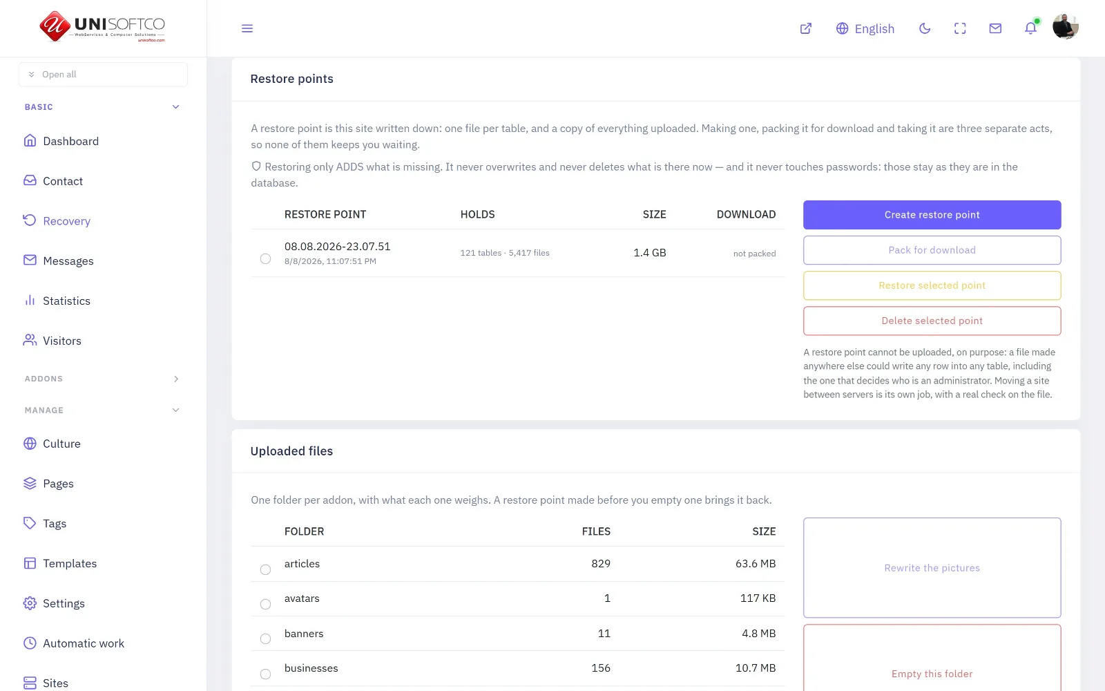
What is in the file
Every table, one readable JSON file each, plus the folders of pictures and documents you uploaded. Readable by anything — a spreadsheet, a script, another platform. A site whose only copy of itself needs the same database engine and the same server is a site nobody can actually leave with.
What is deliberately not in it
No password and no key of any kind. Two tables are never exported at all, columns holding secrets are dropped by name so a new one is covered the day it is written, and the keys stored inside settings are blanked while the setting itself is kept, so you can still see what was configured.
Then the finished file is read back and searched, and a single password marker anywhere refuses the whole export rather than handing it over.
It is not the backup
The backup on the database screen is exact and restorable and stays on the server. This one is readable and comes down to you. You want both, for different days.
Seven Languages
Back to topThe panel's own words, and the words you type, are two different problems solved two different ways.
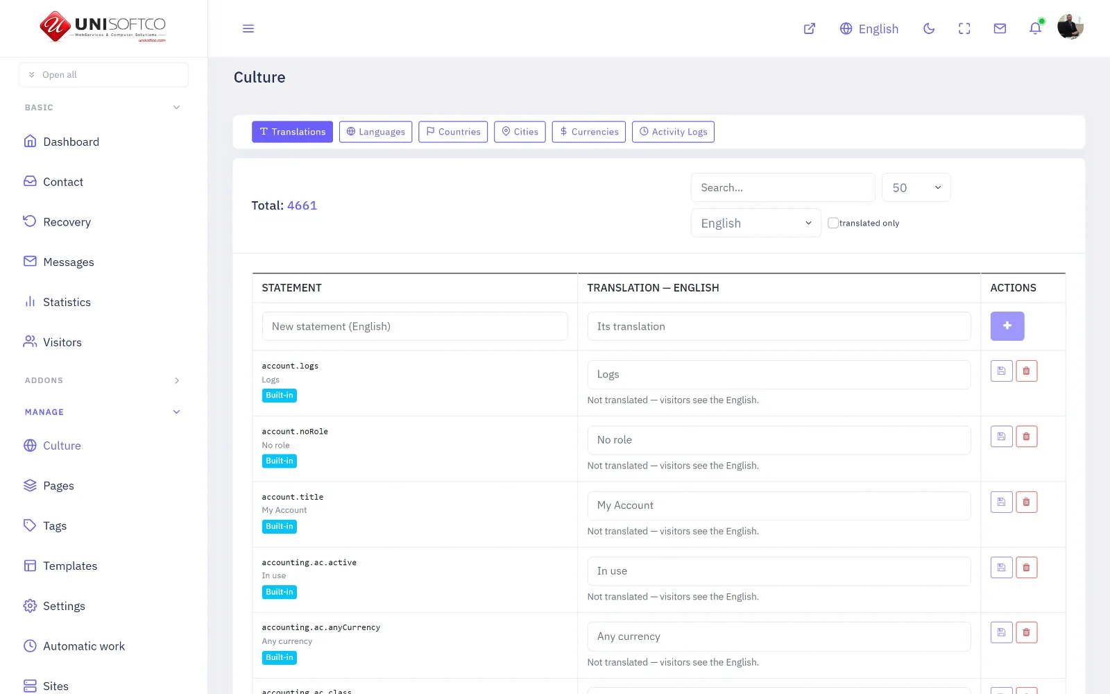
The panel's own vocabulary
Four thousand six hundred and forty phrases, said in English, Arabic, Spanish, Russian, Turkish, Portuguese and Bulgarian. They live in the program rather than in your database, which is what makes them travel: a site created today speaks all seven from its first minute, and none of them had to be typed in by anybody.
You can still change any of them. A phrase you edit is yours from then on and no update overwrites it.
The words you type
A category name, a city, a currency, a company. These are translated per row, and absence is honest: a language nobody filled shows the original word rather than a gap. Clearing a translation removes it rather than storing an empty one.
Right to left is not a coat of paint
The panel is written in logical directions throughout, so Arabic is a genuinely Arabic interface rather than an English one with the corners wrong. Numbers, dates and the "ago" in a relative time each follow the language rather than the direction — those are different questions and Bulgarian is the proof.
Keeping the Books
Back to topDouble entry to international standards, and the two questions a cash book cannot answer.
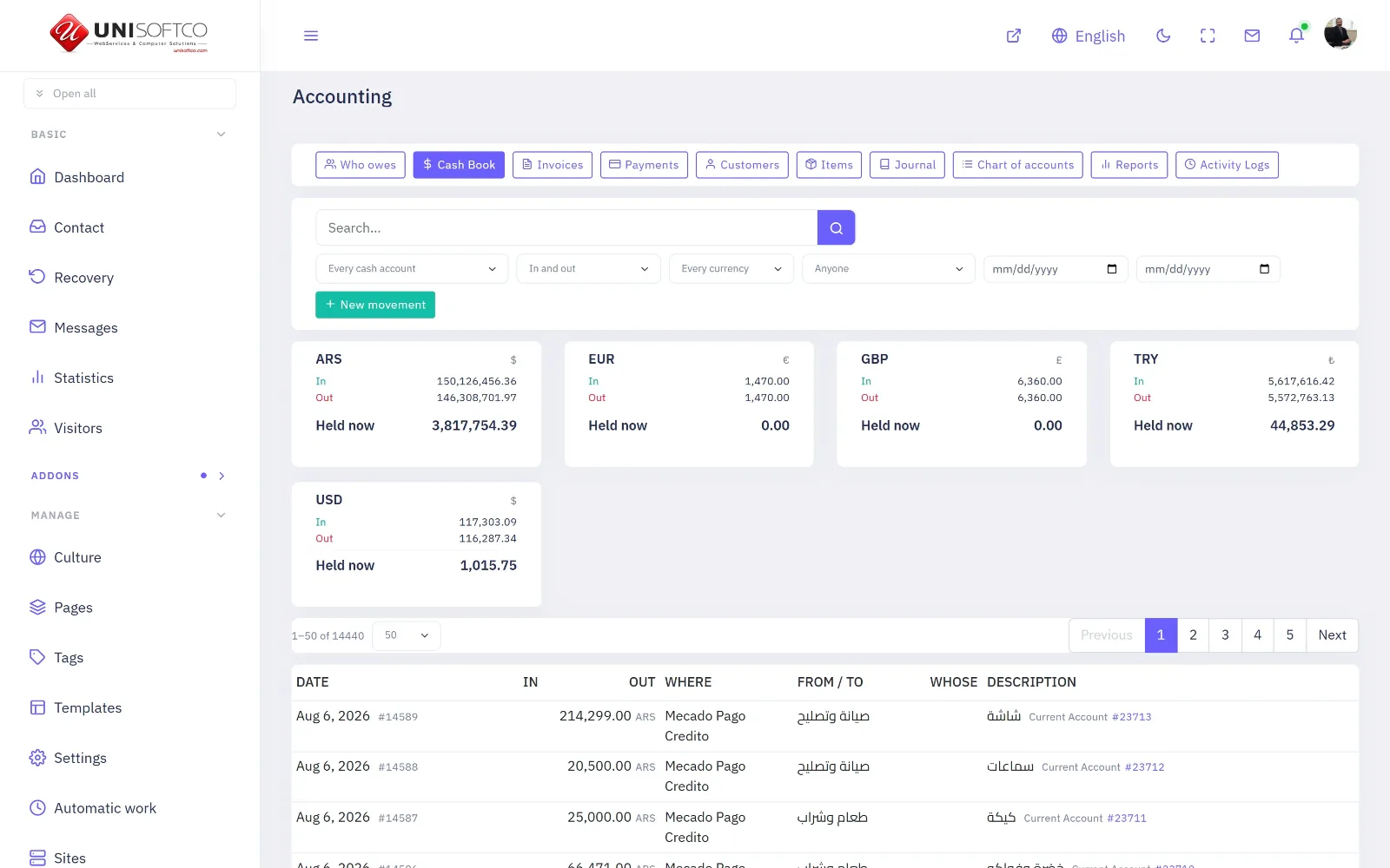
Why double entry and not a cash book
A cash book records money moving. It cannot tell you what somebody owes, because a debt is not a movement — it is the gap between an invoice and the payments put against it.
Every entry here has two sides that must agree, and it is refused if they do not: not warned about, refused. That single rule is what makes every report add up rather than nearly add up.
Owed is never stored
What a customer owes is computed every time it is asked: invoiced, less what has been allocated to those invoices. There is no "paid" flag anywhere, deliberately — a flag has to be kept true by something that runs, and it is wrong every time that thing does not run.
And two numbers are shown, not one: what is outstanding, and what has arrived and not yet been matched to a sale. Only the second can be acted on today.
What is never edited
A posted entry is not changed and not deleted — it is reversed, and both halves stay. Rewriting the original would leave a statement you have already printed disagreeing with the ledger it came from, and nobody could say which was right.
The Cash Book is the one screen most people live in: how much is held in each currency, what moved, and a form that writes either a balanced entry or an invoice depending on whether it was paid now or put on account.
Reading the Numbers
Back to topThree screens that all look like figures about your site, and each answers a different question.
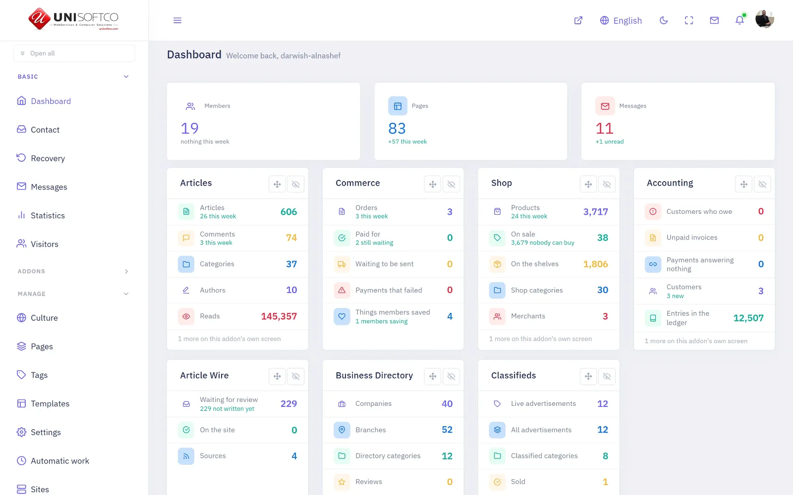
The dashboard is today
What changed, what is waiting for you, and how fast the site is. It is the screen to open first thing and close again — anything on it that needs acting on is one press away from the screen that acts.
Statistics is what the site HOLDS
How many articles, products, companies, advertisements, invoices. Each addon reports its own counts through the same seam, so an addon bought tomorrow appears here without a line changing anywhere in the core.
Every figure is a count and never an amount, and that is deliberate: money formatted on the server would carry the server's language and its currency, and the whole of this panel's number work was to stop exactly that. So it says how many customers owe you, and the amount is one press away on a screen that can draw it in your language.
Visitors is who CAME
One row per visit, with the browser, the device, the country and whether it was a crawler — measured, not estimated. Beside the laboratory speed scores you also get the real Core Web Vitals reported by your own readers' browsers, which is the only speed number that describes your actual audience on their actual telephones.